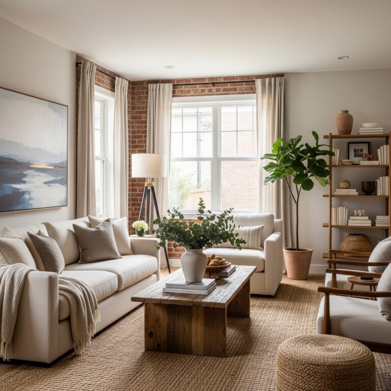
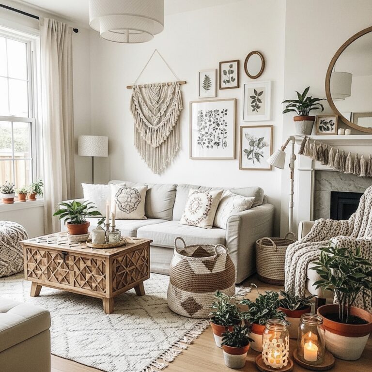
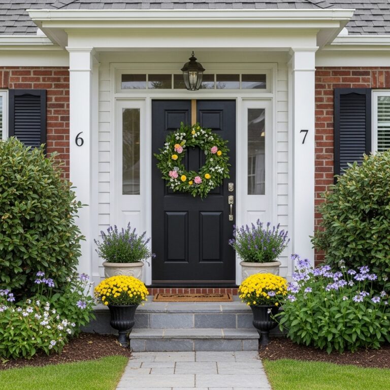
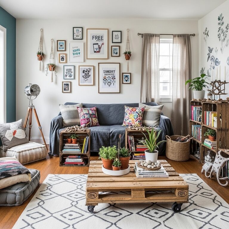
We all want our homes to look warm, stylish, and inviting. But sometimes, without even realizing it, a few decorating choices can make a space feel less polished than we intended. The surprising part? It’s often the smallest details—not the big furniture pieces—that have the biggest impact on how a room looks and feels.
You don’t need a huge budget or a complete makeover to create a home that feels beautiful and well-designed. In fact, many common décor mistakes can be fixed in just a few minutes. Something as simple as rearranging furniture, updating lighting, or removing visual clutter can completely change the atmosphere of a room.
The difference between a home that feels expensive and one that feels unfinished often comes down to thoughtful styling. Designers pay close attention to things like balance, scale, texture, and color, but these tricks aren’t reserved for professionals. Anyone can use them to make their home feel more elevated and welcoming.
In this article, we’re looking at 18+ home décor mistakes that could be holding your space back—and the easy fixes that can make a dramatic difference. If you’ve ever wondered why some homes instantly feel stylish while others don’t, you’re about to discover the little details that make all the difference.
1# Incorrect Rug Scaling
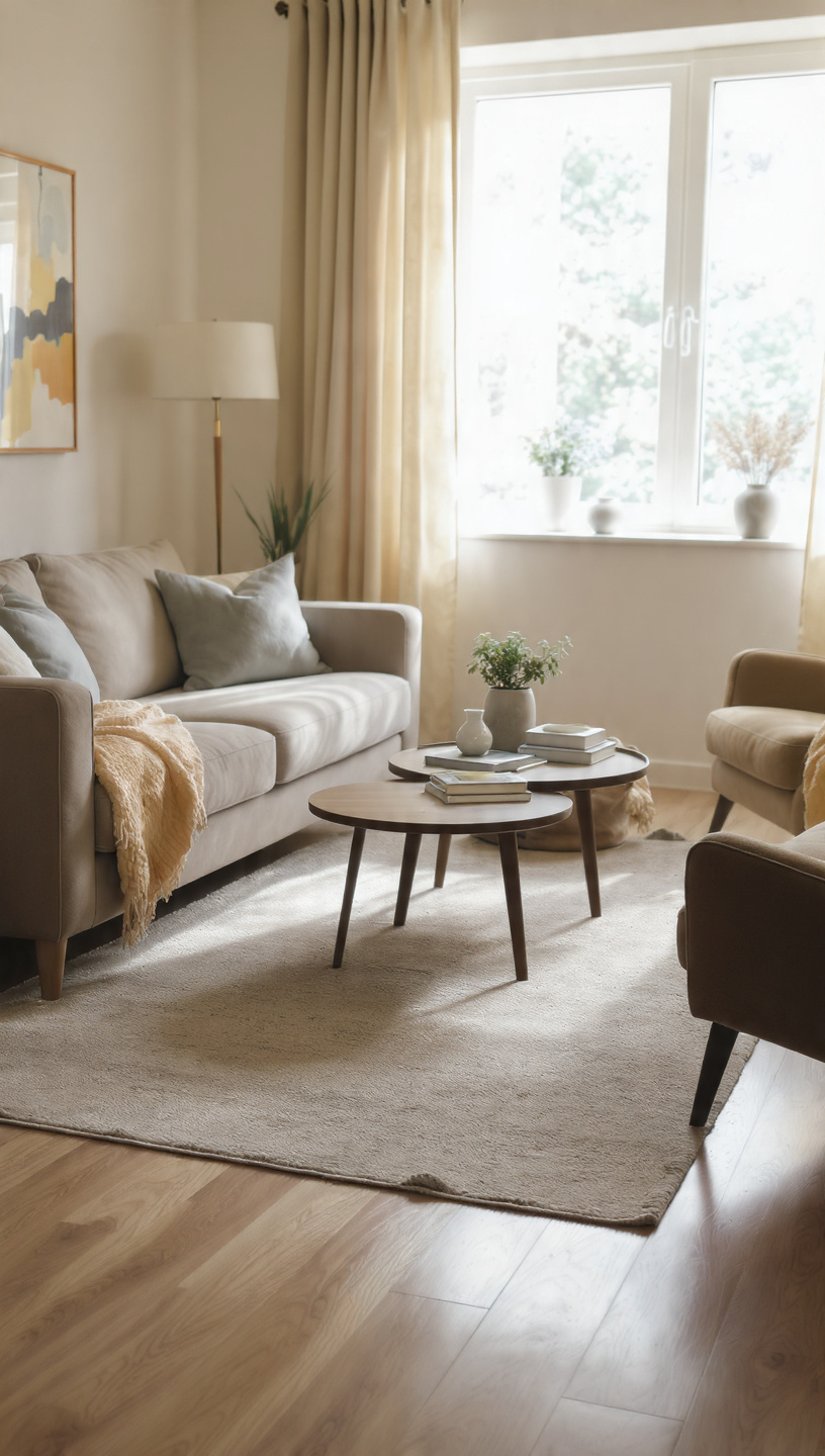
Buying a rug that is way too small for your living area immediately shrinks the room. It makes your furniture look disconnected and creates an awkward, floating island effect in the center of the space.
To fix this, ensure the front legs of all major furniture pieces sit comfortably on the rug. This simple adjustment instantly anchors your seating arrangement and establishes a cohesive, high-end designer foundation.
A larger rug draws the eyes outward, creating the illusion of an expansive and expensive room. Invest in the right scale to instantly elevate the visual weight and comfort of your entire layout.
If a new large rug is outside your budget, try layering a smaller patterned piece over an affordable, oversized jute base. This clever trick adds rich texture while achieving those perfect, spacious proportions.
2# Hanging Curtains Too Low
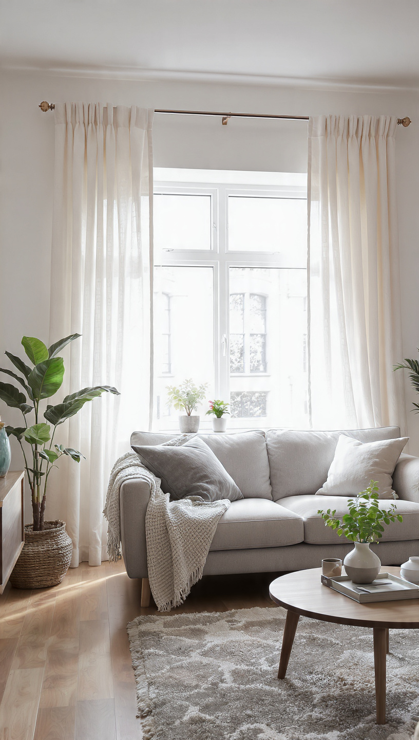
Mounting your drapery hardware directly above the window frame is a classic mistake that cuts your walls short. This placement blocks natural light and makes even the tallest ceilings feel cramped and claustrophobic.
Instead, install your curtain rod just a few inches below the ceiling line to maximize height. Extending the rod past the window sides allows the fabric to frame the glass beautifully.
This easy structural illusion draws the eyes upward, creating a grand, airy atmosphere that mimics luxury hotels. Your windows will instantly look twice their actual size with this quick hardware adjustment.
Ensure your curtains gently brush the floor rather than hanging awkwardly like high-water pants. Opt for crisp linen or heavy cotton blends that drape elegantly to reinforce that tailored, custom look.
3# Matching Furniture Sets
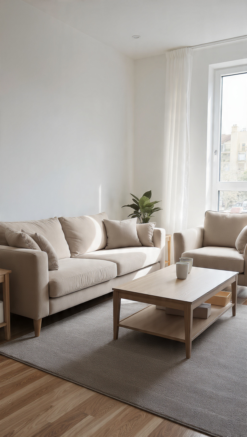
Purchasing an entire matching showroom set is an easy trap that strips your home of character. It instantly screams big-box retail and makes a space feel sterile, predictable, and devoid of life.
The secret to a high-end interior is mixing different textures, eras, and wood tones intentionally. Pair a sleek modern sofa with vintage side tables to build a deeply personal, layered environment.
Combining diverse materials like leather, velvet, and warm woods tells a unique story over time. This approach gives your home a curated, collected feel that looks expensive and effortlessly chic.
Start small by swapping out a matching coffee table for something contrastingly bold or unique. Step-by-step blending ensures your home looks organically designed rather than hastily ordered from a single catalog page.
4# Bad Lighting Choices
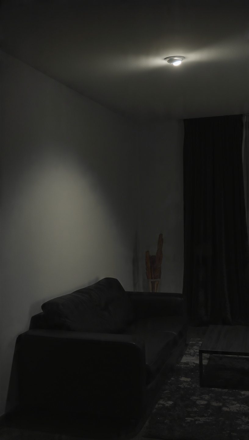
Relying solely on harsh, overhead builder-grade flush mounts creates an institutional, flat atmosphere in any room. Cold, bright white bulbs wash out your decor and highlight every minor imperfection on your walls.
Layering your illumination is the ultimate secret weapon for creating a cozy, high-end ambiance. Combine warm ambient lamps, functional task lighting, and subtle accent features to add dramatic depth and warmth.
Swap out outdated plastic fixtures for striking matte black, brass, or woven organic statement pieces. Adding dimmers allows you to easily control the mood and replicate a soft, sophisticated evening glow.
Pay close attention to bulb temperature, aiming for a warm, inviting range of 2700K to 3000K. This golden hour radiance makes your textiles look richer and your entire home feel instantly more welcoming.
5# Pushing Furniture Against Walls
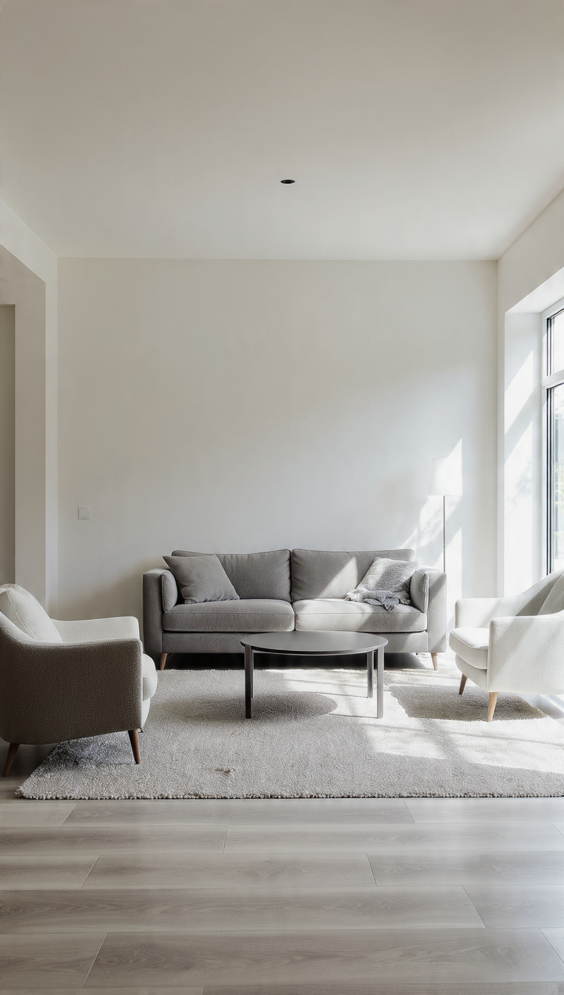
Shoving every single couch and chair directly against the drywall creates a cold, uninviting boundary. This layout leaves a vast, awkward empty space in the middle that feels disjointed and sterile.
Floating your furniture even just a few inches away from the perimeter creates instant breathing room. It fosters intimate conversation zones and naturally improves the overall traffic flow of the entire room.
This simple spatial shift gives your layout an airy, designer-approved look without costing a dime. It immediately signals that your home is thoughtfully arranged for comfort rather than maximum floor exposure.
Try pulling your sofa inward to rest its front feet entirely on your central area rug. You will be amazed at how quickly this minor adjustment transforms a basic room into an elegant lounge.
6# Too Many Small Knick-Knacks
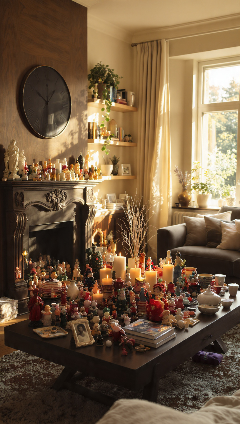
Cluttering your shelves and tables with dozens of tiny, inexpensive trinkets creates visual chaos. Instead of looking curated, a collection of miniature decor items just reads as messy and disorganized.
Embrace the designer philosophy of scaling up your decorative accessories while reducing the total quantity. Display one massive, stunning ceramic vase rather than five tiny plastic figurines on your entryway console.
Grouping a few substantial items creates strong focal points that command attention and look incredibly sophisticated. Leave empty space between arrangements to give your eyes a calm, luxurious place to rest.
Edit your surfaces regularly by boxing up items that do not bring genuine aesthetic value. A clean, streamlined surface always looks infinitely more expensive and intentional than a crowded, dusty shelf.
7# Visible Extension Cords
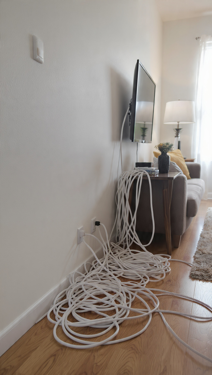
Tangled webs of black and white plastic cords snaking across your floors instantly ruin sleek styling. Exposed wires sticking out from behind media consoles scream afterthought and detract from your beautiful investments.
Hide unsightly cables along baseboards using paintable cord channels that blend seamlessly into your walls. Secure loose wires directly to the undersides of desks and tables using simple adhesive clips.
For floating furniture layouts, run cords beneath large area rugs safely using flat, low-profile extension lines. Keeping power strips tucked away in decorative baskets keeps your tech functional yet completely invisible.
Investing twenty minutes into cable management pays off massively by restoring clean, unbroken visual lines. Your rooms will instantly feel lighter, sharper, and beautifully polished from every single angle.
8# Generic Framed Wall Art
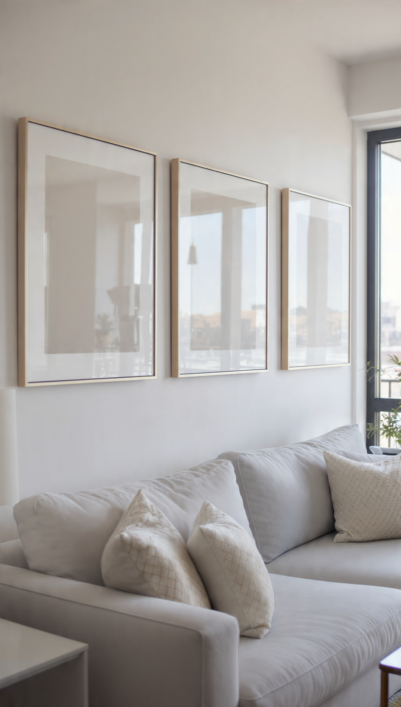
Hanging mass-produced, uninspired canvas prints from local department stores can make your walls feel soul-less. Seeing the exact same generic abstract print in everyone’s living room lowers your home’s unique charm.
Source unique vintage prints online, frame personal travel photography, or create your own bold DIY canvas. Unique, meaningful artwork adds immediate texture, personality, and an authentic gallery feel to your vertical spaces.
Elevate affordable prints instantly by placing them inside oversized frames featuring thick, dramatic white matting. This simple framing trick makes even a basic sketch look like a prized museum acquisition.
Hang your artwork strictly at eye level, which is generally about sixty inches from the floor. Avoid hanging pieces too high, which separates the art from the furniture below it awkwardly.
9# Cheap Plastic Hardware
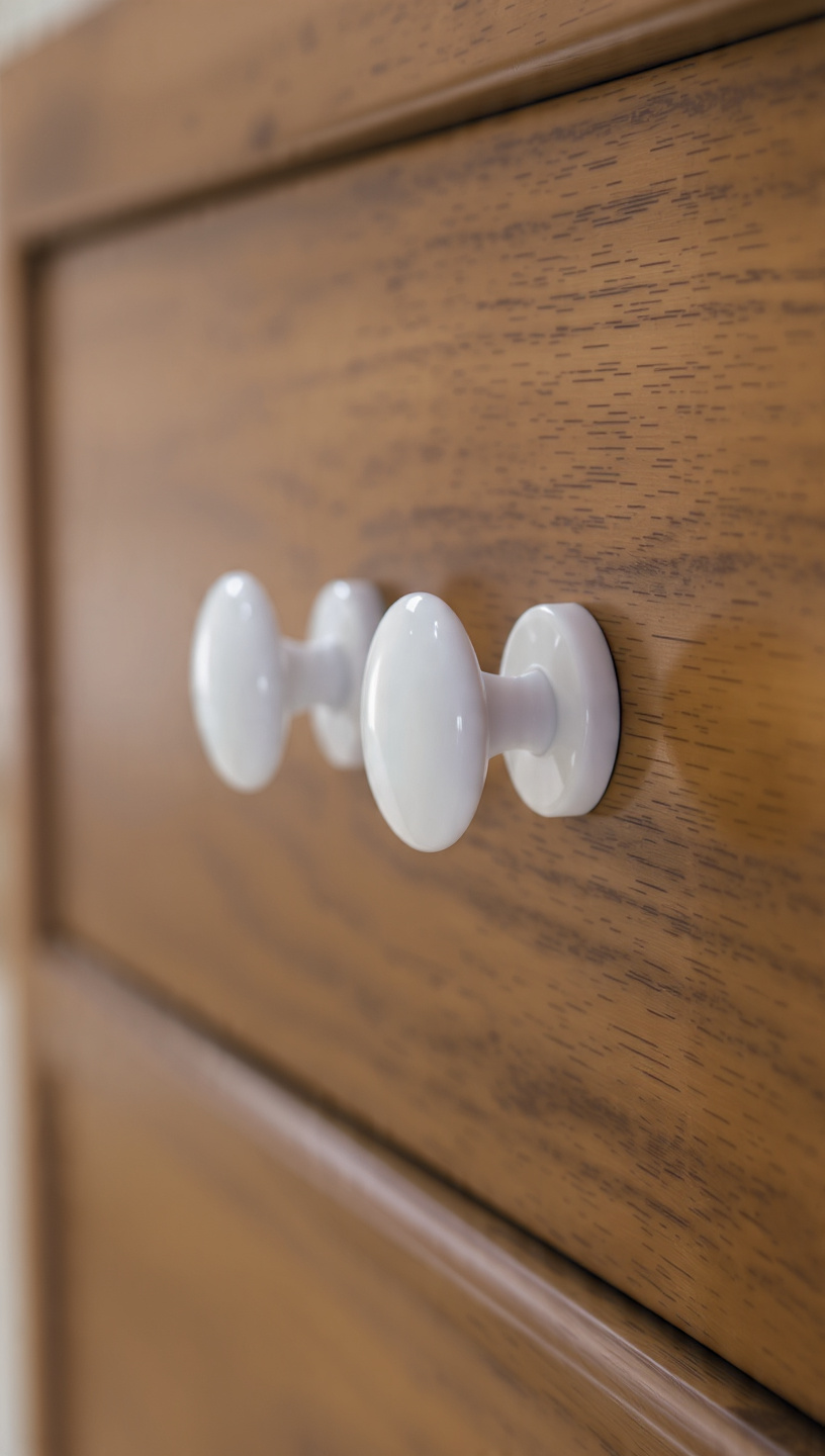
Keeping the standard, hollow plastic or basic silver knobs that came with your cabinets damages your kitchen’s potential. These generic builder details look flimsy and pull down the quality of beautiful cabinetry.
Upgrading to heavy, solid brass, matte black, or sleek oil-rubbed bronze hardware changes everything completely. This affordable DIY project delivers an incredible return on investment by instantly elevating your entire space.
Choose handles and pulls with substantial weight and clean, modern silhouettes for a contemporary feel. The tactile experience of touching high-quality metal daily completely transforms how you interact with your home.
Mix finishes subtly between drawers and doors to achieve a custom, architecturally designed kitchen aesthetic. This tiny detail bridges the gap between generic construction and high-end, bespoke interior styling.
10# Fake Artificial Plants
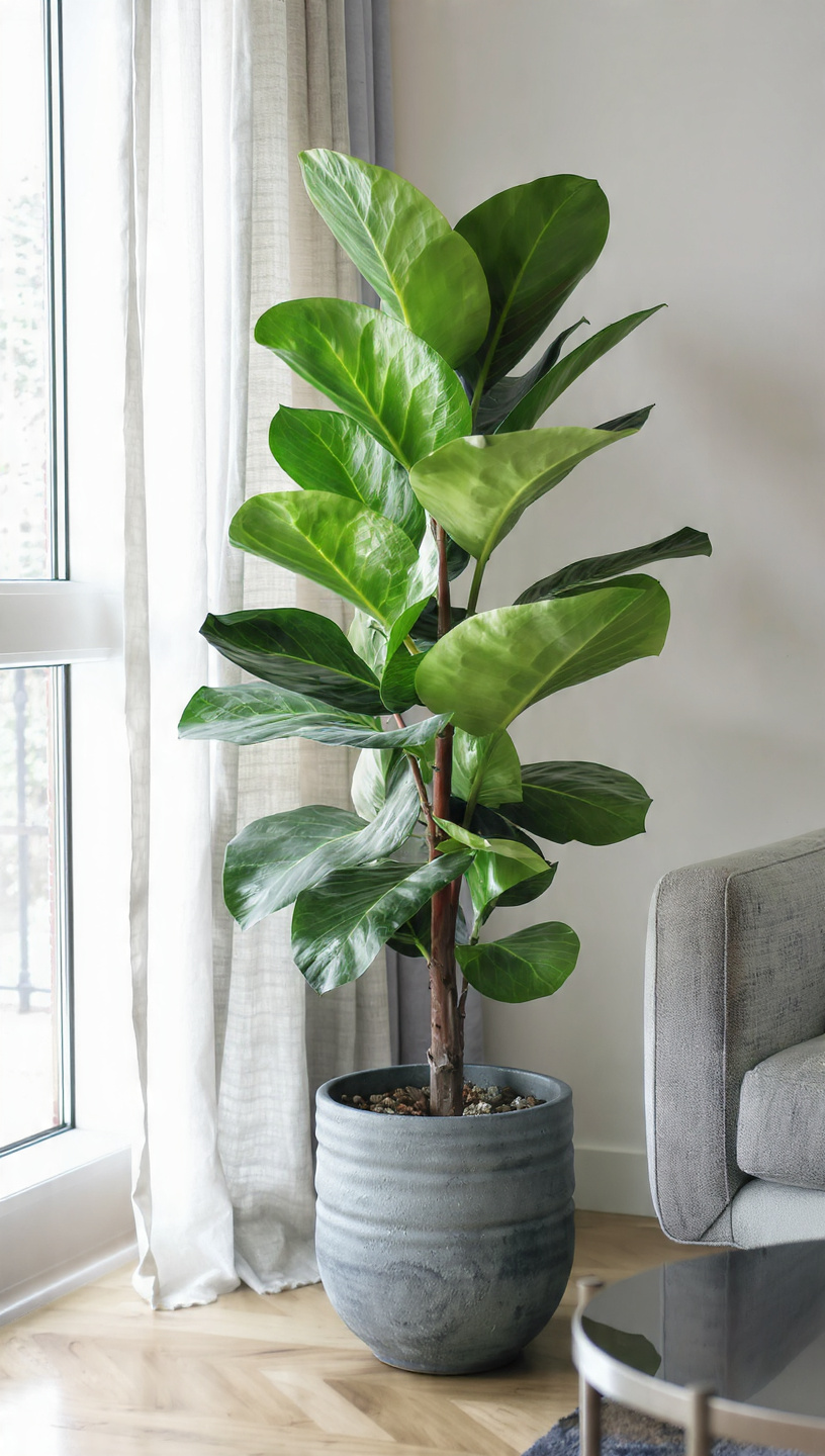
Decorating with bright plastic greenery covered in artificial gloss looks dated and collects dust rapidly. Low-quality faux plants often feature unnatural neon green shades that scream artificial from across the room.
If you struggle to keep plants alive, opt for hardy, low-maintenance real varieties like pothos or snake plants. Real flora purifies your indoor air while adding vibrant, natural texture that artificial stems simply cannot replicate.
When using faux, invest in high-end, realistic branches like preserved eucalyptus, dried palms, or faux olive stems. Place them into heavy ceramic or rustic stoneware vessels to ground them in natural luxury.
Pop a handful of real dirt or moss around the base of your faux potted trees. This simple designer insider trick tricks the eye into believing the entire plant is thriving and real.
11# Unflattering Accent Walls
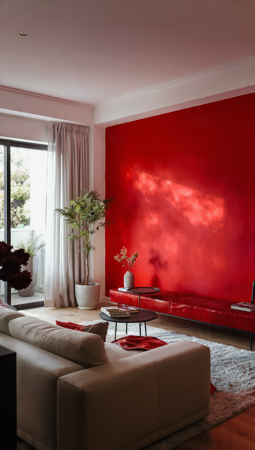
Painting a single, random wall a shocking neon color without any supporting decor elements feels disjointed. It chops your room into awkward segments rather than creating a sophisticated, intentional architectural focal point.
If you want an accent feature, consider rich, moody hues like charcoal, deep olive, or navy. Ensure the chosen color complements the room’s textiles and artwork to weave a harmonious visual story.
Alternatively, explore textured alternatives like sophisticated floor-to-ceiling wood paneling, classic beadboard, or high-end grasscloth wallpaper. These tactile materials add immense depth and physical warmth without relying solely on flat paint.
When in doubt, painting the entire room a single cohesive shade creates a seamless, expansive look. This continuous flow expands your spatial boundaries, mimicking the effortless elegance of high-end custom homes.
12# Flat Poly-Fill Pillows
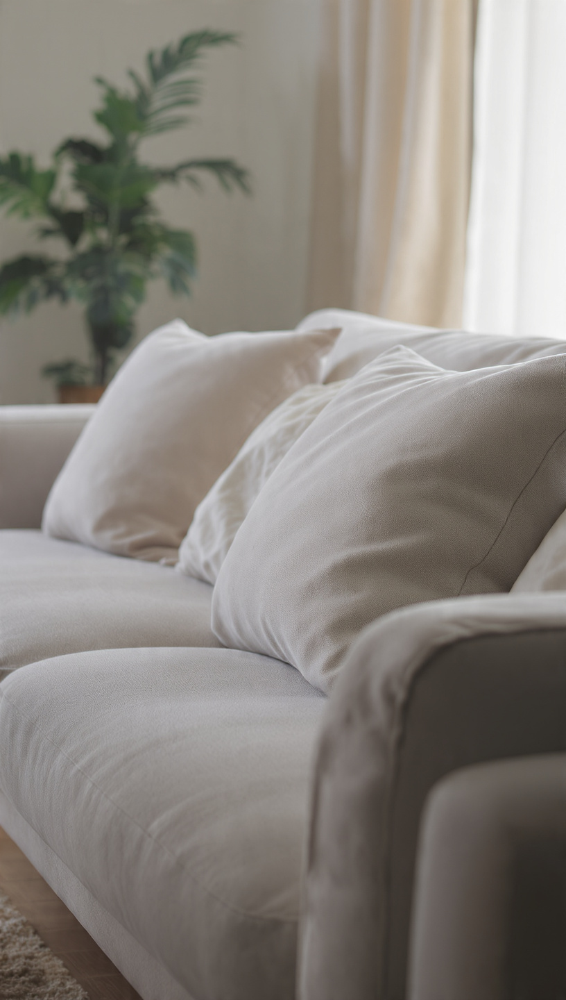
Keeping the flat, deflated throw pillows that originally came with your sofa makes your seating look tired. Low-quality polyester fills bunch up over time, offering zero structural support or plush aesthetic comfort.
Upgrade your inserts to affordable down or heavy faux-down alternatives for a luxurious, plump look. These premium fills allow you to achieve that crisp, designer-approved center karate chop effortlessly every time.
Select pillow covers made from rich, tactile materials like heavyweight linen, chunky wool, or genuine velvet. Mixing textures adds incredible visual dimensions, making your entire sofa setup feel custom-tailored and inviting.
Buy your inserts two inches larger than your covers to ensure a perfectly dense, high-end chop. This simple sizing secret guarantees your cushions look incredibly full, cozy, and expensive all day.
13# Leaving Retail Packaging Out
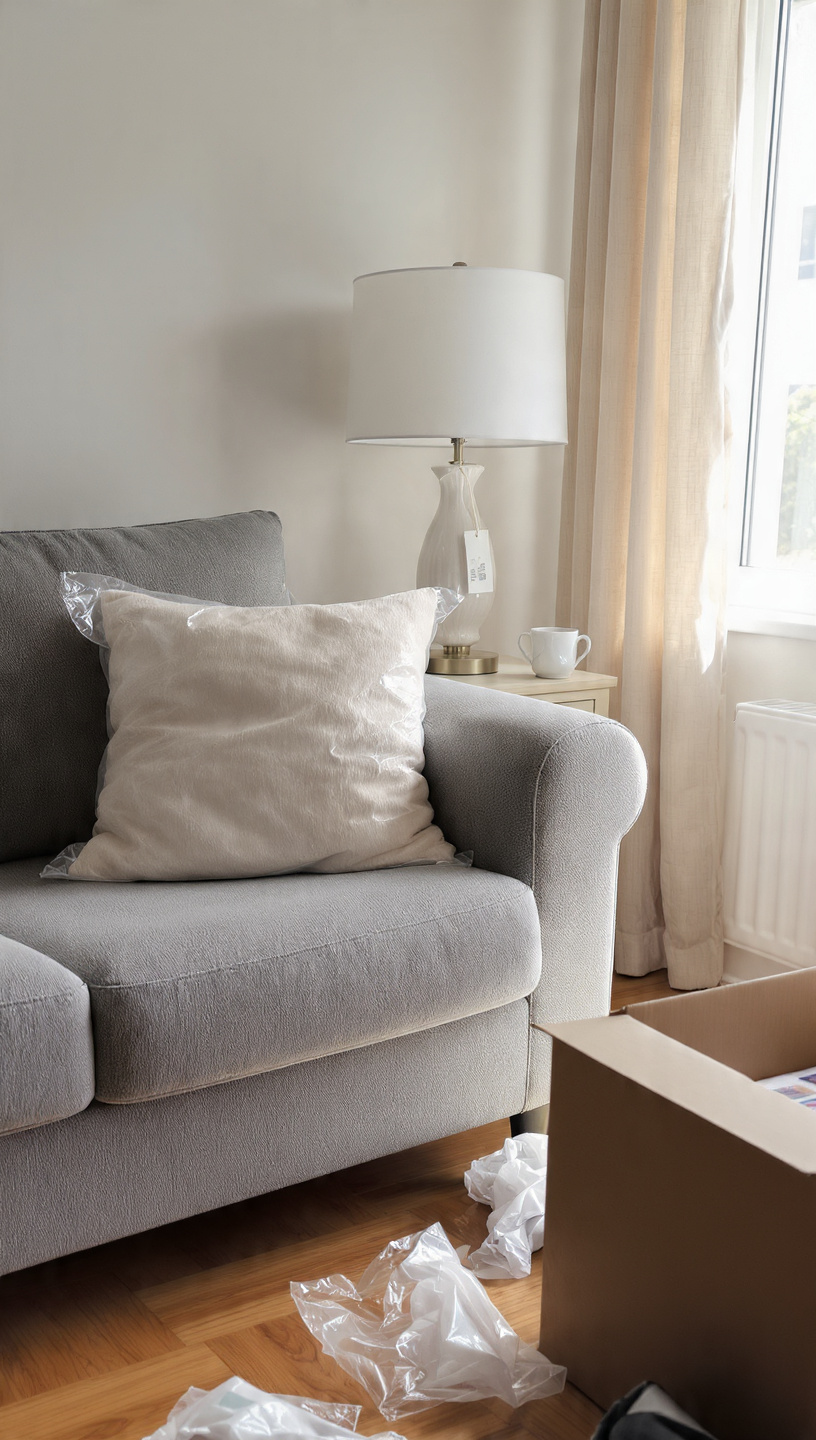
Leaving branded plastic dish soap bottles, neon hand washes, and cardboard tissue boxes out ruins your countertops. These loud, brightly colored advertisements disrupt your hard-earned color scheme and create immediate visual clutter.
Decant your daily essentials into beautiful, refillable amber glass or matte ceramic pump dispensers. This uniform look transforms mundane cleaning supplies into gorgeous, intentional design accessories on your vanity surfaces.
Place kitchen sponges and dish brushes inside a beautiful stoneware dish next to your sink. Hiding the daily grime behind sophisticated containers keeps your functional spaces looking clean and highly organized.
Apply this rule to your bathrooms by transferring cotton pads and swabs into clear glass canisters. These small, thoughtful decanting steps collectively create a serene, spa-like atmosphere throughout your home.
14# Teeny Tiny Floating Shelves
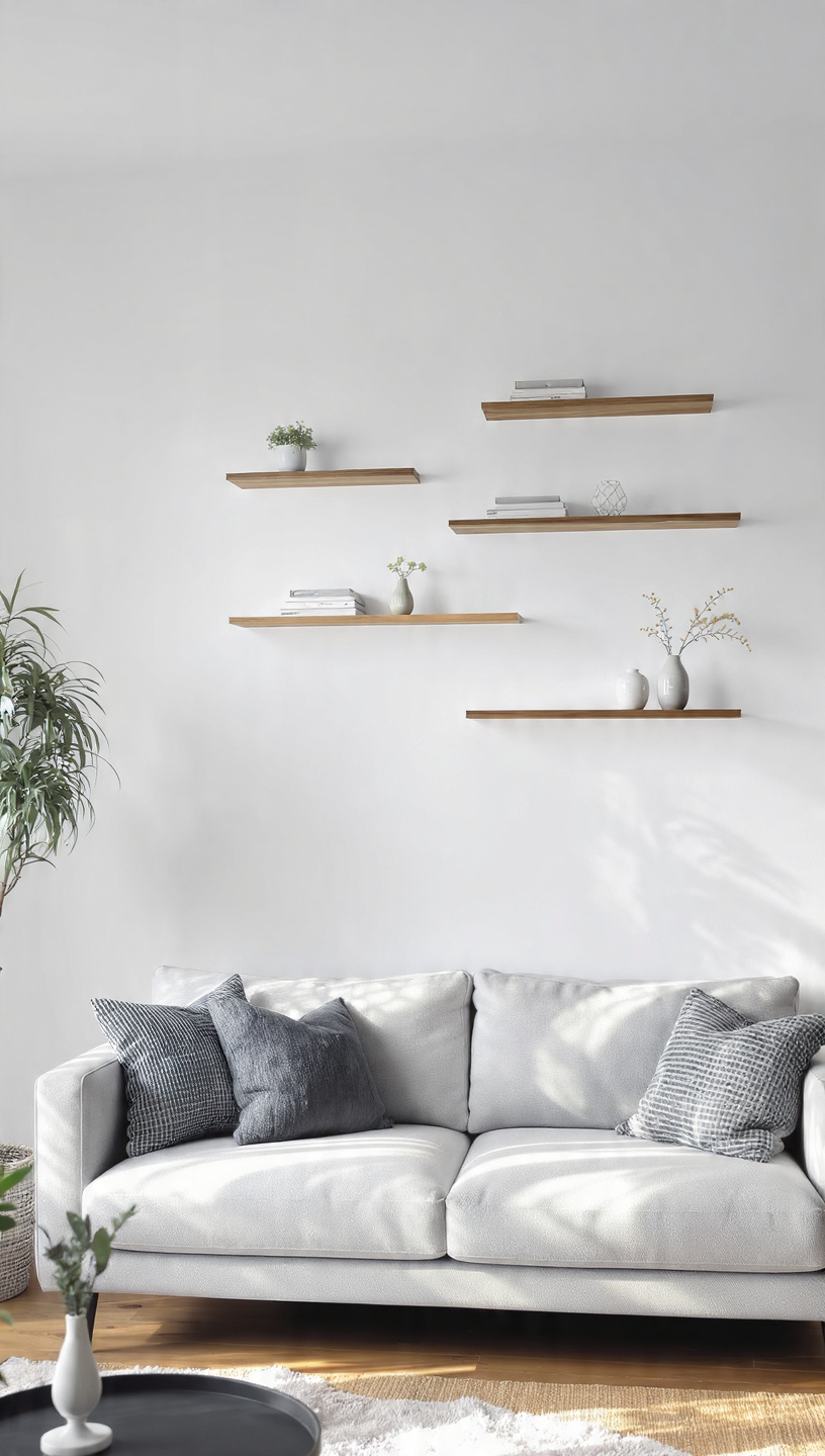
Installing tiny, thin floating shelves randomly on a massive empty wall looks scattered and weak. These small ledges end up packed with clutter, making the wall feel completely unbalanced and disorganized.
Opt for thick, substantial wood or metal shelving units that stretch across a significant wall area. Thicker profiles look anchored, expensive, and capable of holding beautiful, curated decor arrangements with ease.
Style your larger shelves with a thoughtful mix of leaning art, heavy books, and trailing greenery. Vary the heights of your objects to keep the eye moving naturally across the display.
Leave plenty of open, negative space on your shelves to prevent a heavy, overcrowded appearance. This deliberate restraint gives your styled pieces room to breathe, highlighting their individual beauty and value.
15# Skirting Boards Left Bare
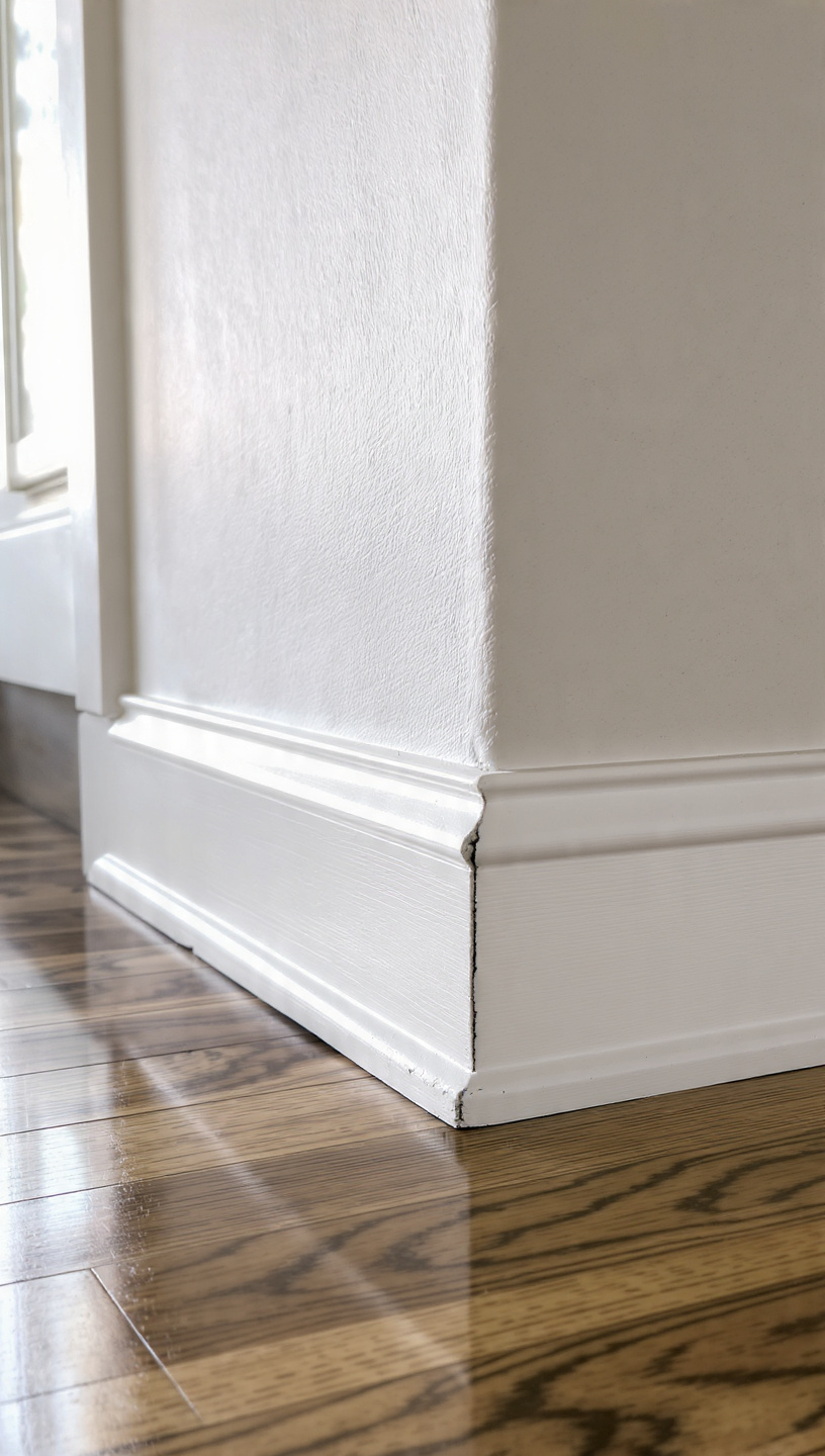
Leaving plain, thin builder-grade baseboards white while walls are painted rich colors creates an unfinished look. The stark contrast draws attention to the shortest part of the room, shortening your walls visually.
Paint your baseboards, trim, and doors the exact same color as your walls for a modern monochromatic look. This sophisticated technique erases harsh boundaries, making your ceilings appear incredibly tall, seamless, and custom.
If you prefer classic contrast, choose a rich satin trim paint that is slightly darker than your walls. This tailored detail adds a beautiful, historic architectural layer that feels intentional and deeply elevated.
Ensure your trim work is kept clean, free of scuffs, and freshly caulked along the seams. Pristine architectural details form the quiet backbone of every beautifully designed, luxury-level home interior.
16# Neglecting the Entryway
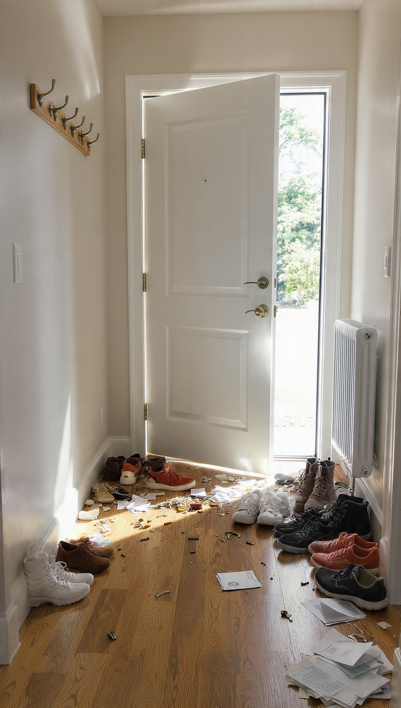
Treating your entryway as a chaotic dumping ground for dirty shoes, loose mail, and jackets ruins first impressions. A cluttered front door setup instantly sets a stressful, unpolished tone for the rest of your home.
Designate a stylish console table paired with a large, stunning mirror to instantly anchor the entrance. Add a beautiful ceramic bowl to catch keys and loose change before they scatter everywhere.
Incorporate a handsome woven basket beneath the table to neatly conceal everyday shoes and wet umbrellas. Keeping this high-traffic zone organized ensures you walk into a calming, designer-worthy view every evening.
Add a subtle signature scent using a luxury reed diffuser or a high-quality soy candle nearby. A beautiful aroma combined with an organized layout welcomes guests with immediate, unforgettable sensory sophistication.
17# Exposed Plastic Trash Cans
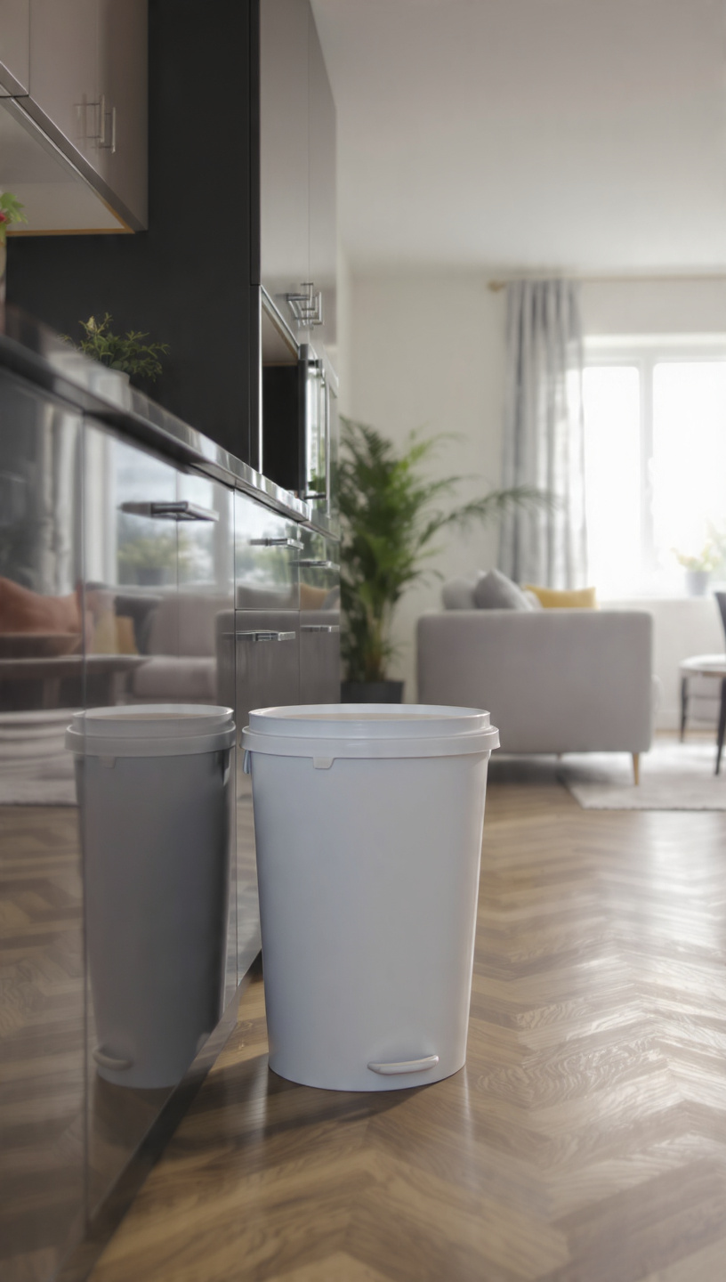
Placing a bright, uncovered plastic garbage bin right out in the open disrupts your kitchen’s flow. It draws the eye directly to waste, instantly lowering the overall aesthetic value of your cooking space.
Hide your trash bins entirely inside lower cabinetry using an affordable pull-out drawer conversion kit. This simple modification keeps your waste hidden away while preserving clean lines along your kitchen island.
If cabinet space is tight, invest in a sleek, stainless steel step-can with a fingerprint-resistant finish. Choose a color that matches your appliances, like matte black or brushed brass, to blend in beautifully.
Keep your bin spotlessly clean on the outside to maintain a polished, hygienic cooking environment. A concealed or elevated trash system shows incredible attention to detail, reinforcing a truly luxury kitchen vibe.
18# Short Area Runners
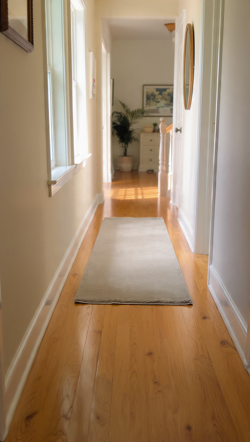
Placing a short, stubby rug runner in a long hallway looks awkward and unfinished. It cuts the hallway into fragmented pieces, making a natural transition zone feel cramped and poorly planned.
Measure your hallway accurately and purchase a runner that covers nearly the entire length of the floor. Leave a consistent three to five inches of flooring visible on all sides for balance.
A properly fitted runner elongates your hallway, drawing the eye forward and creating a grand entrance feel. Choose a durable, low-pile vintage-inspired pattern to handle high foot traffic while looking incredibly upscale.
Secure the long runner firmly with a high-quality, non-slip pad to prevent dangerous shifting and bunching. A perfectly straight, flat rug runner instantly gives your hallways a tailored, architecturally sound appearance.
Wrap-Up: Elevate Your Space Easily
Transforming your home from basic to beautiful doesn’t require a massive budget or major renovations. By simply correcting these minor styling missteps, you can instantly unlock your home’s true aesthetic potential.
Take your time addressing each room, focusing on scale, lighting, and intentional curation to build your dream look. With a few thoughtful adjustments, you will create a cohesive, luxury environment that feels uniquely yours.
Loved these styling tips? Pin this article to your favorite Home Decor board on Pinterest to save these easy fixes for your next weekend project! Share your home transformations with us in the comments below.