
Finding the perfect balance between cozy and cool starts with the colors you choose for your walls and furniture.
Japandi Color Palette Ideas is a beautiful marriage of Japanese minimalism and Scandinavian warmth, relying on a specific set of tones to create a serene, spa-like atmosphere at home.

In this guide, we explore how to blend these two worlds using a curated selection of earthy and neutral tones. Get ready to transform your living space into a tranquil sanctuary that feels both modern and timeless.
1#. The Foundation of Warm Oatmeal
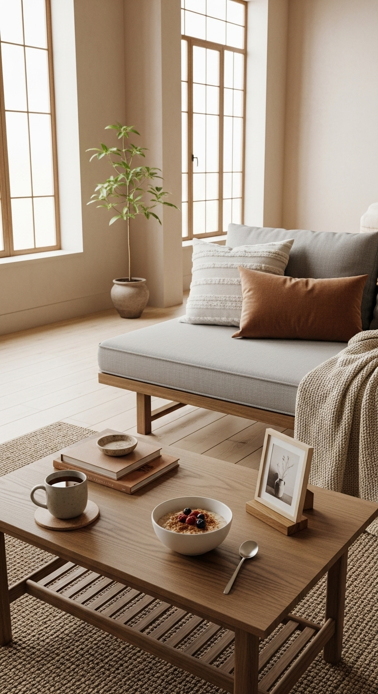
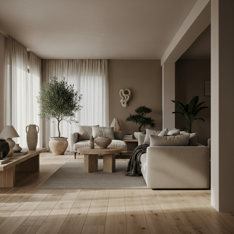
Start your journey by embracing the soft, creamy tones of warm oatmeal for your primary wall color. This specific choice provides a much softer feel than a clinical, stark white.
It acts as a perfect canvas for light wood furniture and textured linens throughout your living room. This hue creates an immediate sense of warmth while maintaining the clean, bright look of minimalism.
You can balance these neutral walls by incorporating muted sage or dusty olive green accents. These earth-inspired tones prevent the space from feeling flat while adding a touch of nature.
Layering these shades through pillows or ceramic vases adds depth without cluttering the visual field. The goal is to keep the room feeling airy, calm, and grounded in organic, subtle color.
2#. Deep Charcoal for Sophisticated Contrast
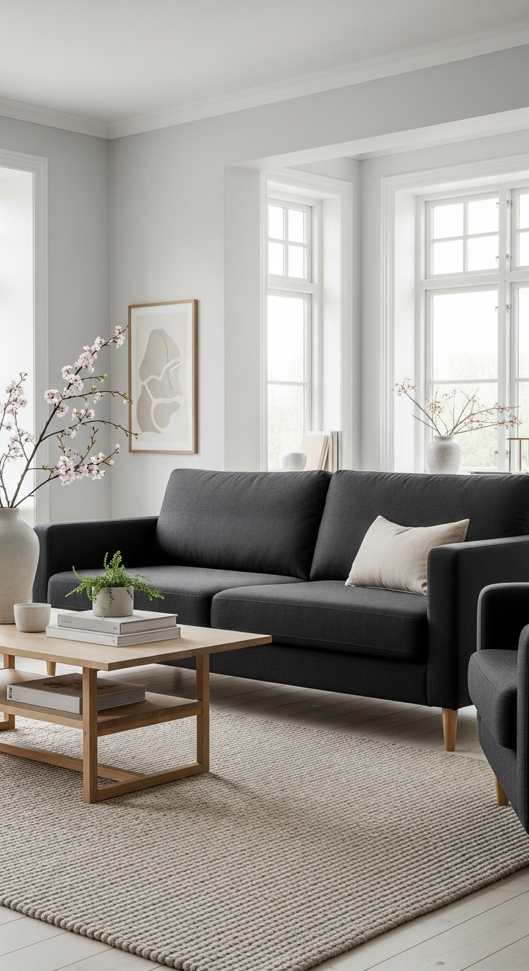
Introduce deep charcoal or soft black to ground your space and add a touch of modern Japanese edge. Use this darker shade for window frames, light fixtures, or a single statement chair to create focus.
This contrast is vital for preventing a neutral room from looking washed out in natural daylight. It provides the sharp definition that separates a modern Japandi look from a purely traditional style.
Think of these dark elements as the ink brush strokes on a clean, light-filled rice paper canvas. They pull the eye toward specific design features rather than letting the room feel overly diffuse.
Keep these accents disciplined by limiting them to hardware or specific furniture pieces rather than walls. A measured approach ensures the room remains serene and inviting without becoming heavy or cold.
3#. Muted Sage for an Organic Touch
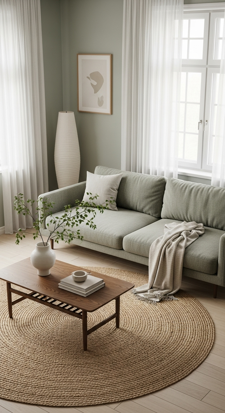
Muted sage is a cornerstone of the Japandi palette because it brings the peace of nature indoors. This dusty green works beautifully as a transition color for kitchen cabinetry or soft throw pillows.
It pairs naturally with light oak and bamboo, reinforcing the connection between interior and exterior. This organic tone promotes relaxation and makes any room feel like a quiet garden retreat.
You can layer this shade through textiles like linen curtains or even a textured wool area rug. Adding these botanical layers helps break up the starkness of neutral walls without introducing visual noise.
Avoid overly vibrant greens, as they can disrupt the gentle equilibrium found in classic Japanese design. Focus instead on muted, earthy variations that sit quietly in the background of your daily life.
4#. Soft Stone and Pebbled Grey
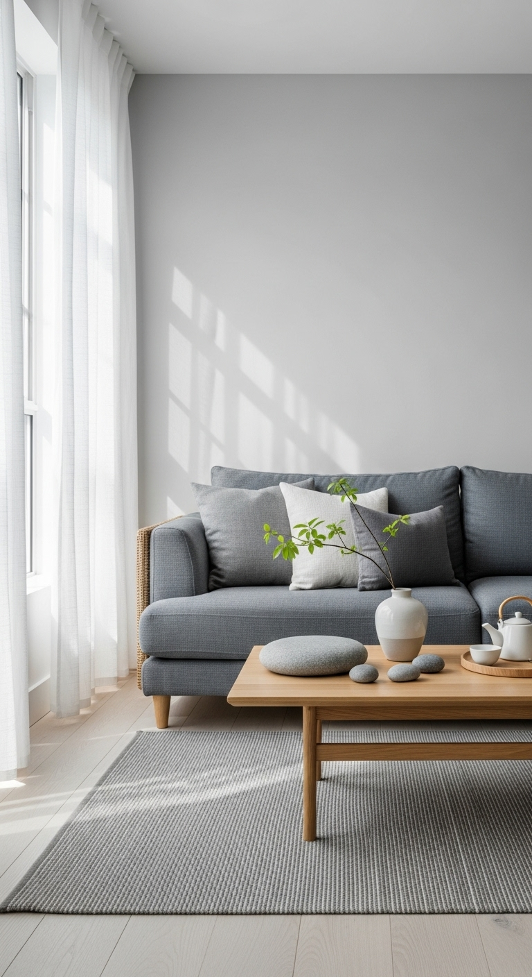
Soft stone greys offer a cool, calming presence that mimics the look of traditional Japanese rock gardens. Use this hue for large-format floor tiles or linen sofas to provide a sturdy foundation for decor.
Unlike blue-toned greys, stone-inspired shades have a warm undertone that keeps the environment cozy. It is a versatile choice that works seamlessly across every room in a modern home renovation.
These greys excel when placed next to natural textures like rattan baskets or unfinished wooden side tables. The contrast between the smooth mineral color and the raw organic material creates a balanced atmosphere.
Consider using this palette for primary furniture items to establish a sense of weight in the room. A grey sofa serves as a neutral anchor that allows other soft accents to shine without competition.
5#. Sun-Baked Terracotta Accents
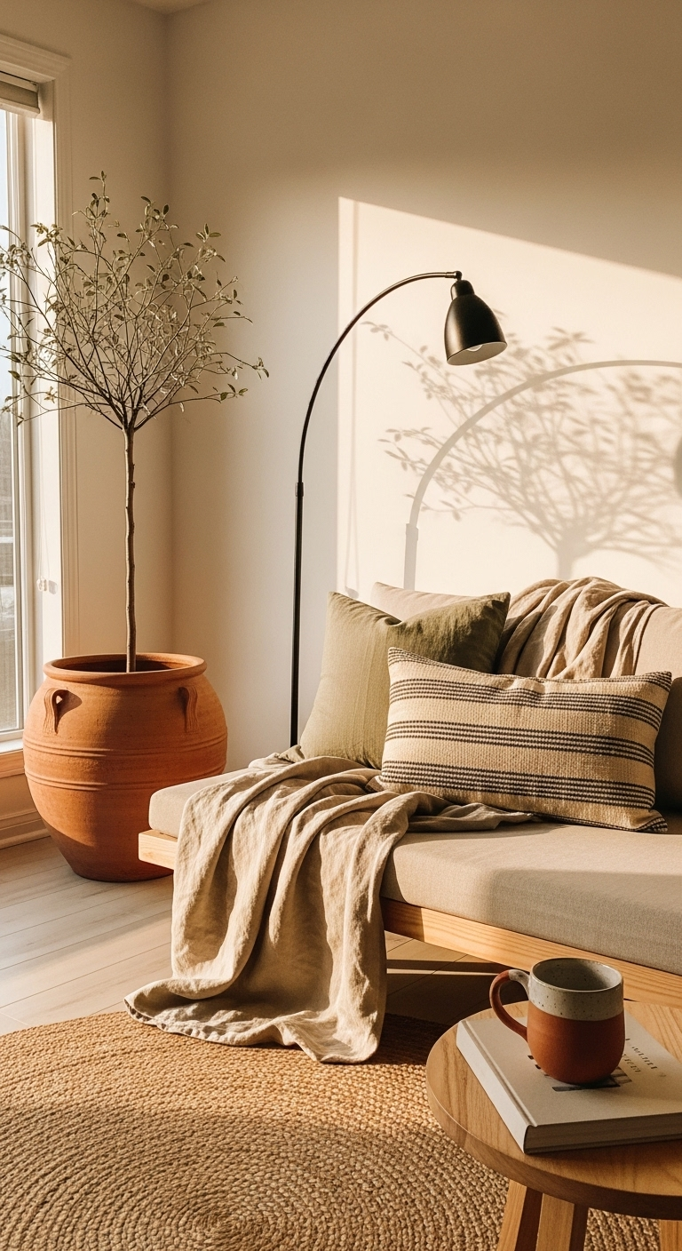
For a hit of warmth, incorporate sun-baked terracotta as a secondary accent in your color scheme. This clay-like color adds a rustic, wabi-sabi charm to your pottery, vases, and small decorative items.
It provides a beautiful pop of earthy color that does not overwhelm the senses or disrupt flow. This hue is especially effective at making a white or grey kitchen feel much more handcrafted.
Use these warm tones sparingly through hand-thrown bowls or a single, prominent piece of clay art. The goal is to introduce subtle, sun-drenched character that feels collected rather than bought new.
These items anchor a room by connecting your design to the history of natural, fired earth materials. They add an essential layer of texture that keeps a minimalist space from feeling too clinical.
6#. Dusty Nordic Blue
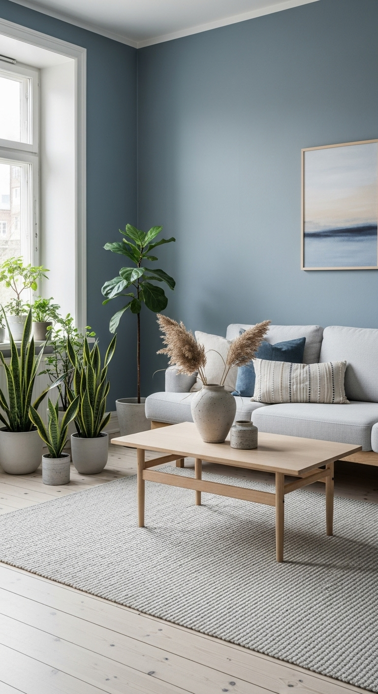
Bring in the cool serenity of the Northern fjords by using a dusty, grey-toned blue for textiles. This shade is perfect for bedroom linens or curtains, as it naturally encourages deep rest.
Nordic blue serves as a bridge between the two cultures, offering a softness that feels minimalist. It adds a sophisticated layer of color that remains firmly rooted in the natural world.
Pair this specific blue with light wood furniture to prevent the room from feeling too icy. The combination mimics the look of a mountain lake reflecting a crisp, winter sky at dawn.
Keep the patterns minimal and the textures varied to maintain a high-end, uncluttered aesthetic. This color acts as an anchor that grounds the room while maintaining an open, airy feeling.
7#. Raw Linen and Sand Tones
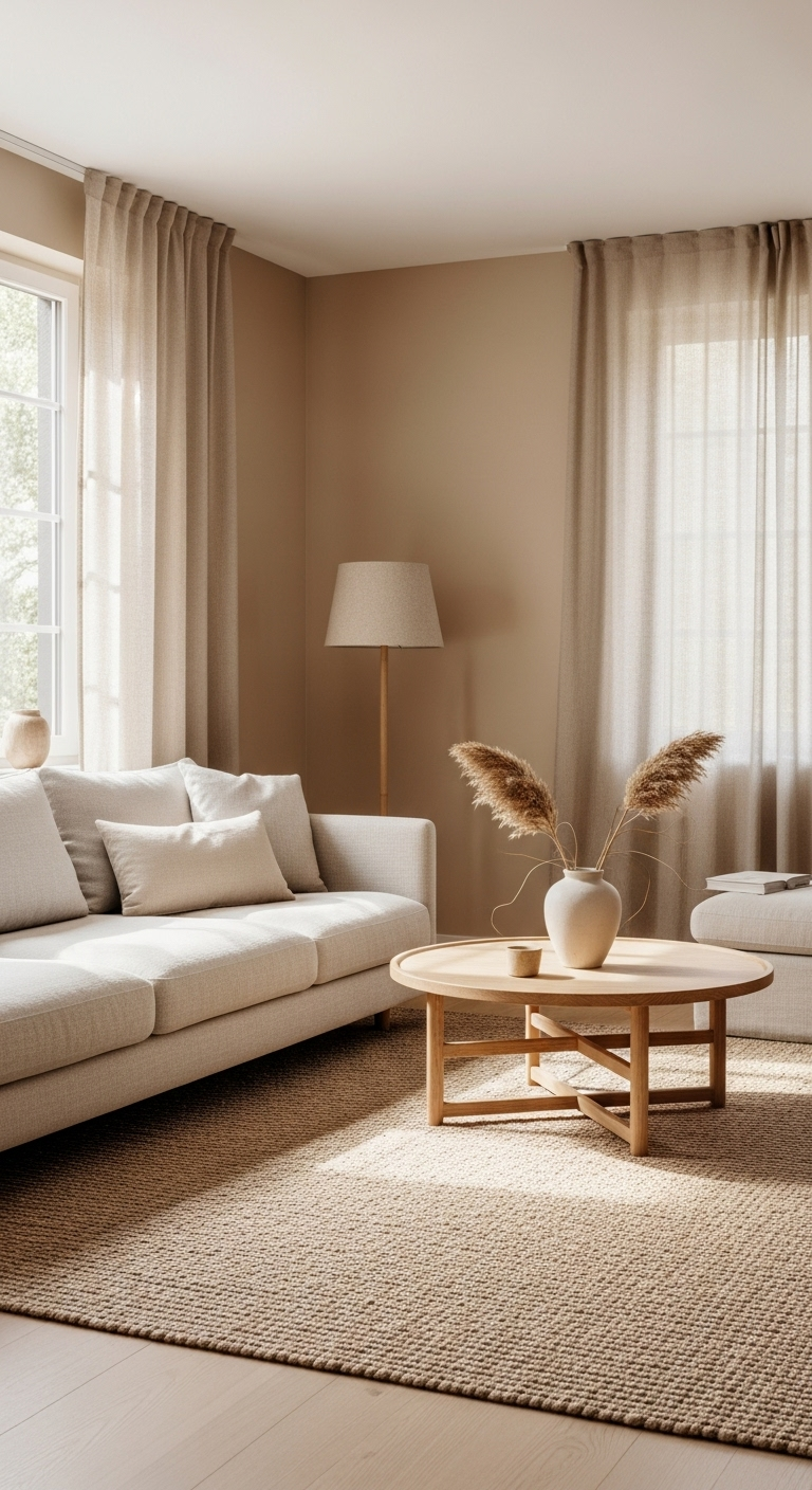
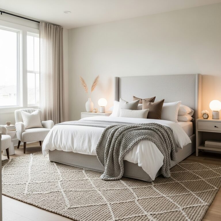
The colors of raw linen and dry sand are essential for creating a tactile, multi-layered environment. Use these shades for rugs, window treatments, and benches to add visual interest through texture.
These sandy tones help to blur the lines between different materials, making rooms feel cohesive. They are the ultimate practical choice for anyone looking to master a high-end designer look.
Focus on layering different fabrics in these shades to build depth without relying on bright colors. A coarse linen curtain paired with a plush wool rug creates a complex, yet quiet experience.
These neutrals act as the glue for your design, allowing natural light to bounce around easily. They ensure your home remains a bright, airy sanctuary that feels polished and intentionally curated.
8#. Rich Walnut for Depth
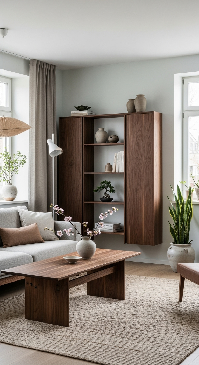
While light woods are common, incorporating rich walnut adds a layer of Japanese-inspired luxury. The dark, chocolatey grain of walnut provides a stunning anchor for rooms with large windows.
It creates a sense of permanence and history that balances lighter, airy Scandinavian elements. This deeper wood tone is a great way to make a dining room feel intimate and formal.
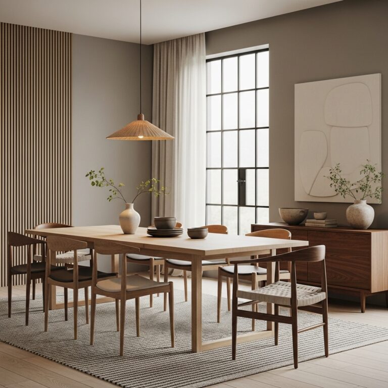
Use walnut for statement pieces like a credenza or a dining table to ground the space. When these dark pieces sit against light walls, they create a crisp, high-contrast visual impact.
Limit the use of walnut to one or two pieces to ensure the room stays balanced. The deep finish adds a refined quality that prevents a minimalist home from feeling empty.
9#. Pale Straw and Natural Wicker
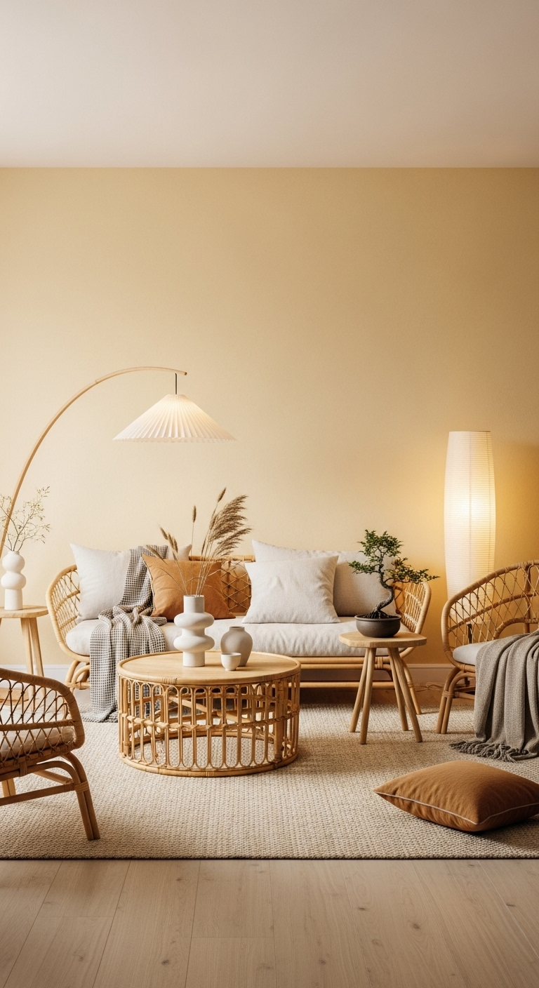
Pale straw tones found in wicker and rattan are perfect for adding a lightweight, breezy feel. These honey-colored hues catch the light beautifully and add a golden glow during sunset hours.
Using accessories in these natural colors is a budget-friendly way to experiment with your palette. They bring a sense of craftsmanship and artisanal detail to even the most modern, sleek spaces.
Place a woven basket or a natural fiber stool near an entryway to greet guests warmly. These pieces offer a tactile warmth that breaks up hard architectural lines in a contemporary home.
The golden undertones help bridge the gap between white walls and darker wood furniture items. These small additions prove that you can achieve a sophisticated, layered look with simple materials.
10#. Soft Clay and Putty
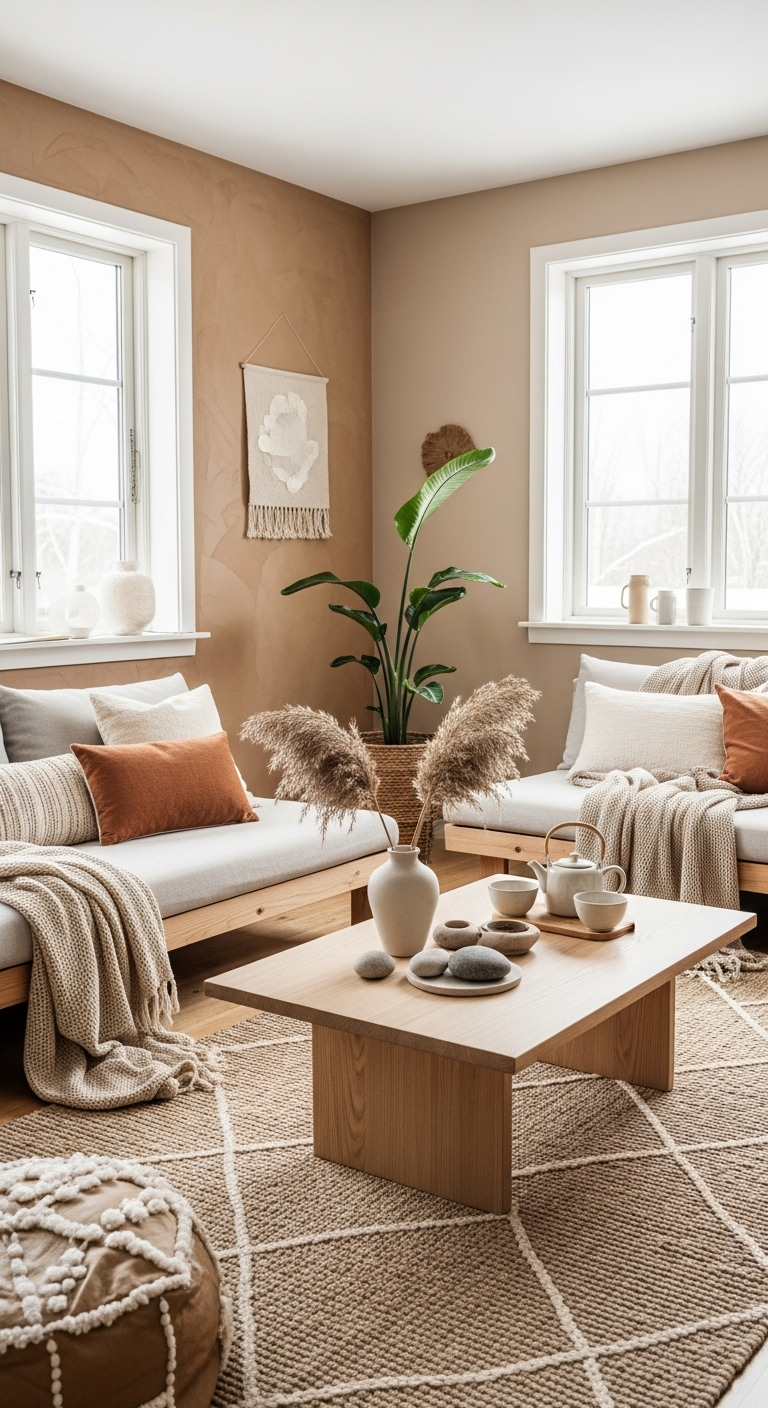
Soft clay and putty colors are the perfect middle ground for those who find beige too warm. These versatile greige tones are popular because they adapt to changing light throughout the day.
Use putty for your built-in cabinetry to create a look that feels custom and high-end. It is a sophisticated choice that ensures your home feels modern without appearing dated.
These neutral shades provide a quiet backdrop that lets your favorite furniture pieces stand out. Because they sit perfectly between cool and warm, they harmonize with almost any other color.
Try painting your trim or doors in these earthy shades for a subtle, designer-inspired contrast. This application adds just enough depth to make your living space feel intentional and complete.
11#. Dark Forest Green
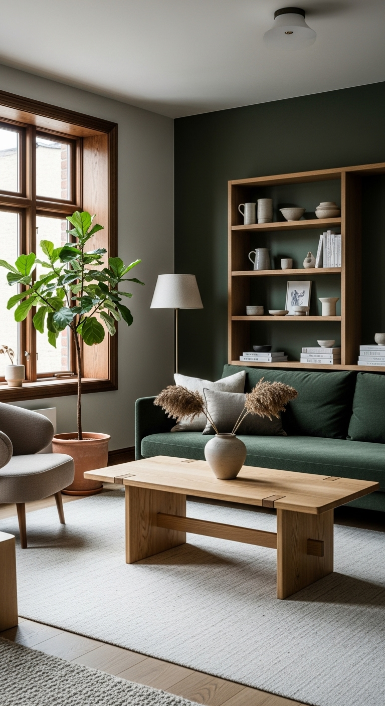
For a moodier take on the trend, use dark forest green as a saturated accent in an office. This color provides a quiet, studious energy that pairs perfectly with black or brass hardware.
It feels like a more mature version of sage, providing luxurious depth that honors nature. Dark green acts as a beautiful backdrop for light wood shelving and curated ceramic collections.
This shade creates an enveloping atmosphere that encourages focus while remaining soft and serene. It works effectively in smaller rooms where you want to create a sense of cozy intimacy.
Use it on a single feature wall or cabinetry to ground the room with dramatic flair. When balanced by airy light woods, the overall effect remains perfectly aligned with minimalist goals.
12#. Warm Taupe for Coziness
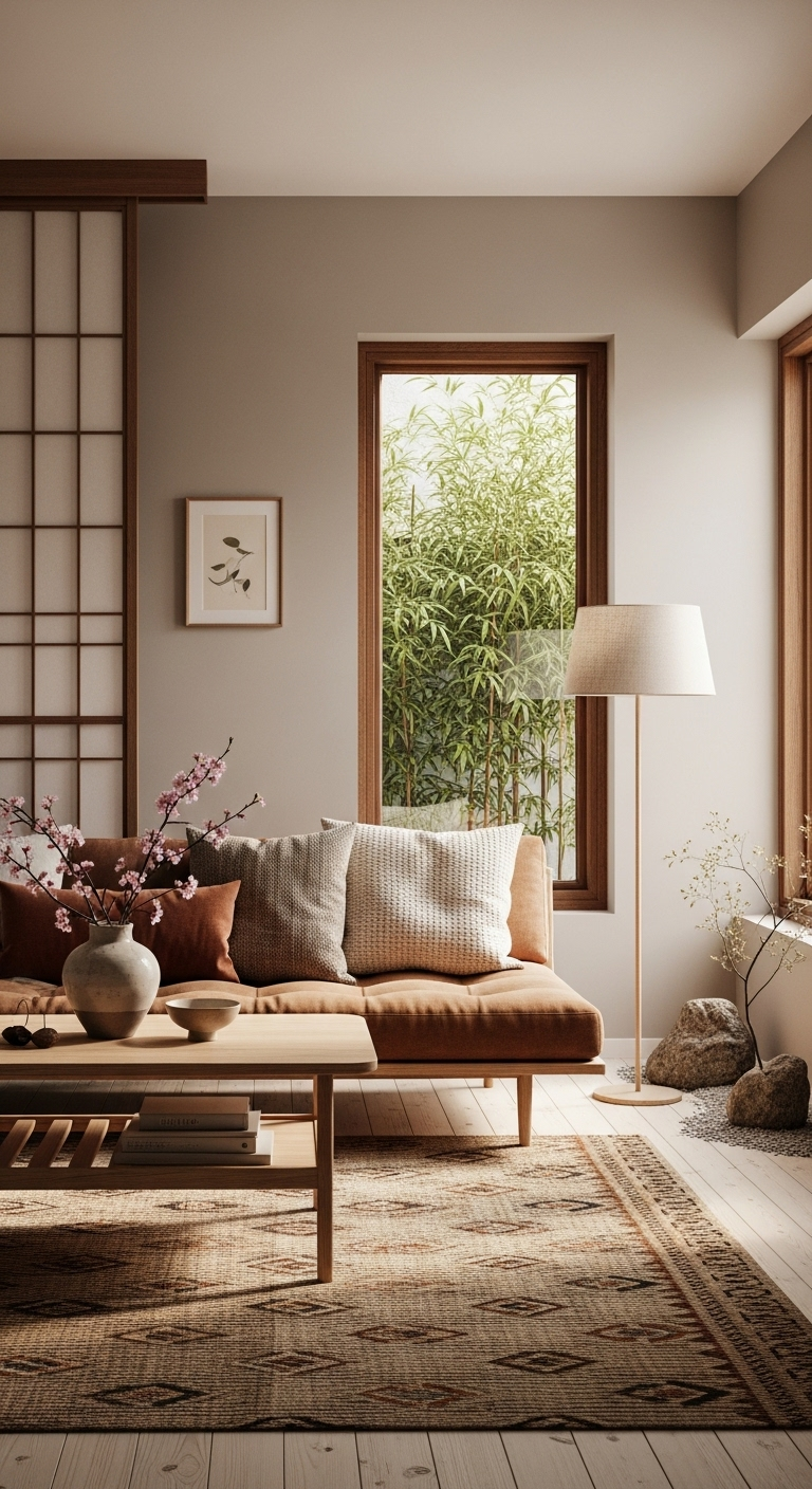
Warm taupe is a reliable choice when searching for a color that maximizes interior comfort. This shade is slightly richer than sand, making it perfect for plush rugs or blankets.
It wraps the room in a sense of security and warmth, the ultimate goal of design. Taupe works best in spaces where you want to linger, such as a reading nook.
The undertones in this color prevent it from feeling sterile, even in very bright rooms. It pairs exceptionally well with natural textures like unvarnished wood or raw stone surfaces.
Use this hue on large upholstery pieces to establish a soft, inviting base for layering. It provides a stable foundation that keeps the rest of your decor feeling harmonious.
13#. Ink Black for Graphic Lines
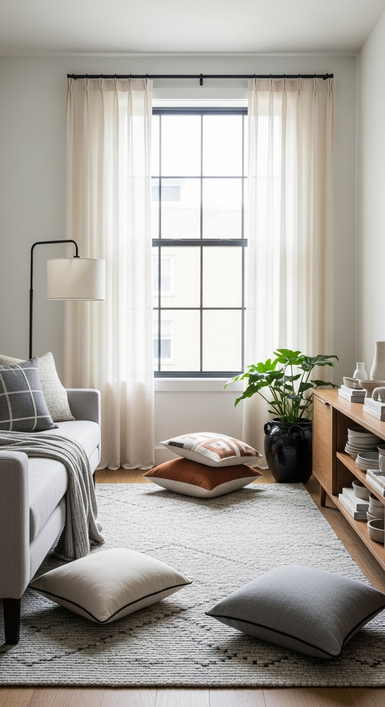
Japanese design often uses ink black to create sharp, graphic lines that define the architecture. Use this for slim-profile dining chairs or minimalist picture frames to add a curated touch.
A few black accents help the lighter colors pop, making the palette feel intentional. It is the final detail that gives a minimalist home its sophisticated and modern personality.
The visual weight of black provides a necessary anchor in rooms dominated by neutral tones. It forces the eye to notice the silhouette of your furniture rather than just the color.
Apply this sparingly to maintain the serene equilibrium central to the Japandi design philosophy. When used with restraint, these dark lines create a sense of order and quiet rhythm.
14#. Creamy Vanilla and Pearl
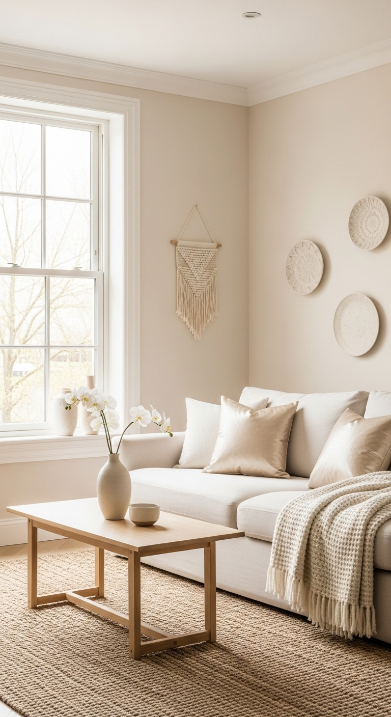
Avoid stark whites in favor of creamy vanilla and pearl tones to keep your trim soft. These whites have a hint of warmth that makes them feel natural under artificial light.
They provide a bright, clean look that still feels gentle on the eyes during the day. Using pearl-toned paint is a simple way to make a room feel expensive and curated.
These shades act as a quiet canvas that reflects light without creating a clinical atmosphere. They harmonize beautifully with the various wood tones and earth-inspired accents in your home.
Consistency is key when applying these softer whites across your baseboards and ceiling lines. This approach creates a seamless, sophisticated transition that opens up your living environment.
15#. Earthy Umber and Sienna
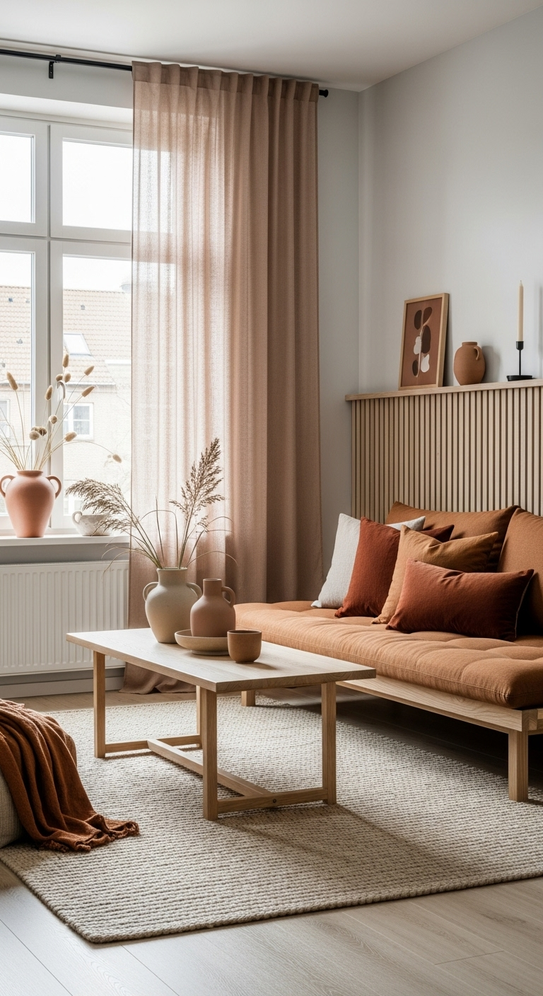
Incorporate umber and sienna through your artwork and pillows for grounded, Mediterranean-inspired warmth. These reddish-brown tones feel incredibly organic, celebrating the raw beauty of natural pigments.
They add a sense of soul and character that prevents a room from feeling generic. These colors are best used in small, meaningful doses to maintain the room’s tranquility.
Pair these deep tones with lighter neutral fabrics to create a balanced, high-contrast effect. The earthy quality of these shades provides a necessary anchor against softer beige walls.
Focus on finding textiles or prints that feature these colors in subtle, muted patterns. This intentional layering ensures that the space remains sophisticated while feeling lived-in and comfortable.
16#. Mist Grey and Fog
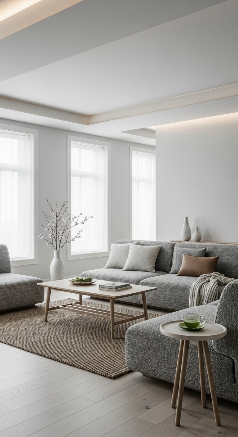
Mist grey is a very light, almost white shade that works perfectly for bathrooms. It provides a clean, airy vibe that feels organized without being cold or clinical.
Pair this color with chrome or matte black hardware for a look that is timeless. It is one of the most refreshing choices for high-traffic areas like your utility rooms.
This shade excels at reflecting light, which helps smaller spaces feel significantly more open. Because it sits so close to white, it remains the perfect backdrop for textured tiles.
Consider using this tone on vanity cabinets or as a primary wall color to ground space. It creates a bright, polished environment that stays easy to maintain and visually peaceful.
17#. Toasted Almond Wood Tones
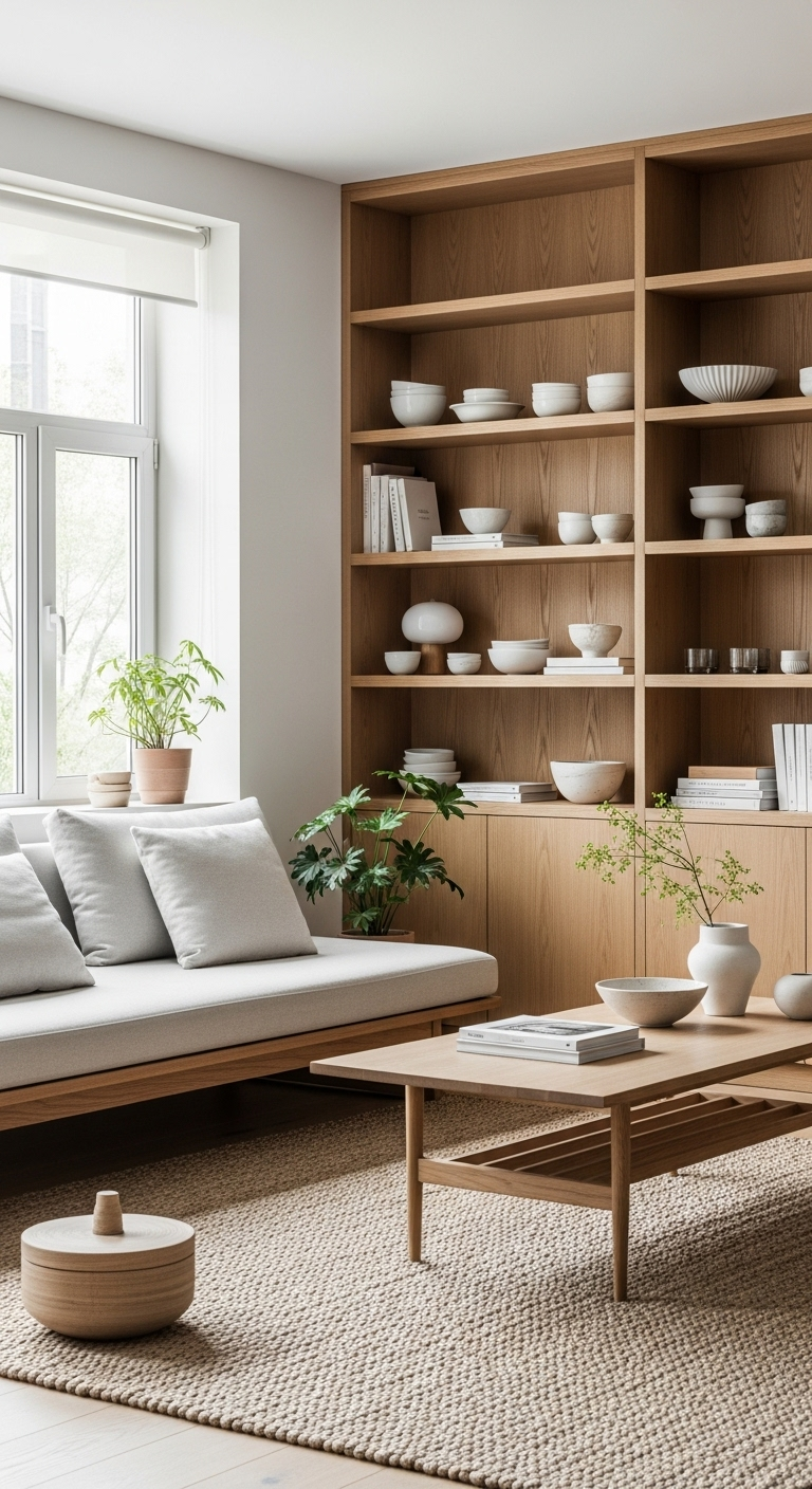
This wood shade serves as a fantastic bridge between classic Mid-Century silhouettes and the clean lines of modern Japandi design. You can lean into a minimalist aesthetic by keeping surfaces clear and letting the natural grain of the wood stand out.
If your home features light neutral walls, these pieces add the necessary depth to prevent the room from appearing flat. The medium tones reflect light gently, creating a cozy atmosphere that feels both sophisticated and welcoming for daily living.
For a more dramatic contrast, try placing these furniture items against darker accent walls like charcoal or deep sage green. This approach highlights the warmth of the toasted almond shade, making the furniture a central focal point of your design.
Mixing different wood textures is a pro strategy that adds layers of interest without cluttering your visual environment today. Try layering a toasted almond side table next to a matte black lamp or a soft wool throw for contrast.
18#. Dusty Rose for Softness
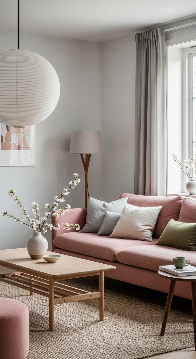
A very soft, dusty rose shade introduces an elegant layer of feminine warmth to bedrooms dominated by grey or white. This particular color is so muted that it acts effectively as a neutral, providing gentle character without becoming overwhelming.
Using such a restrained palette allows you to influence the mood of your private space without clashing with existing decor. It brings a quiet, romantic energy that is essential for rooms primarily intended for evening rest and daily relaxation.
Designers often choose this specific tone because it bridges the gap between cold, sterile walls and warmer home furnishings. You can easily layer it into your bedding, throw pillows, or window treatments to create an inviting, cohesive sanctuary atmosphere.
The beauty of this shade lies in its ability to shift under different lighting conditions throughout the day and night. It remains a sophisticated choice for anyone wanting a subtle color shift that feels curated rather than overtly decorative.
19#. Smoked Oak and Ash
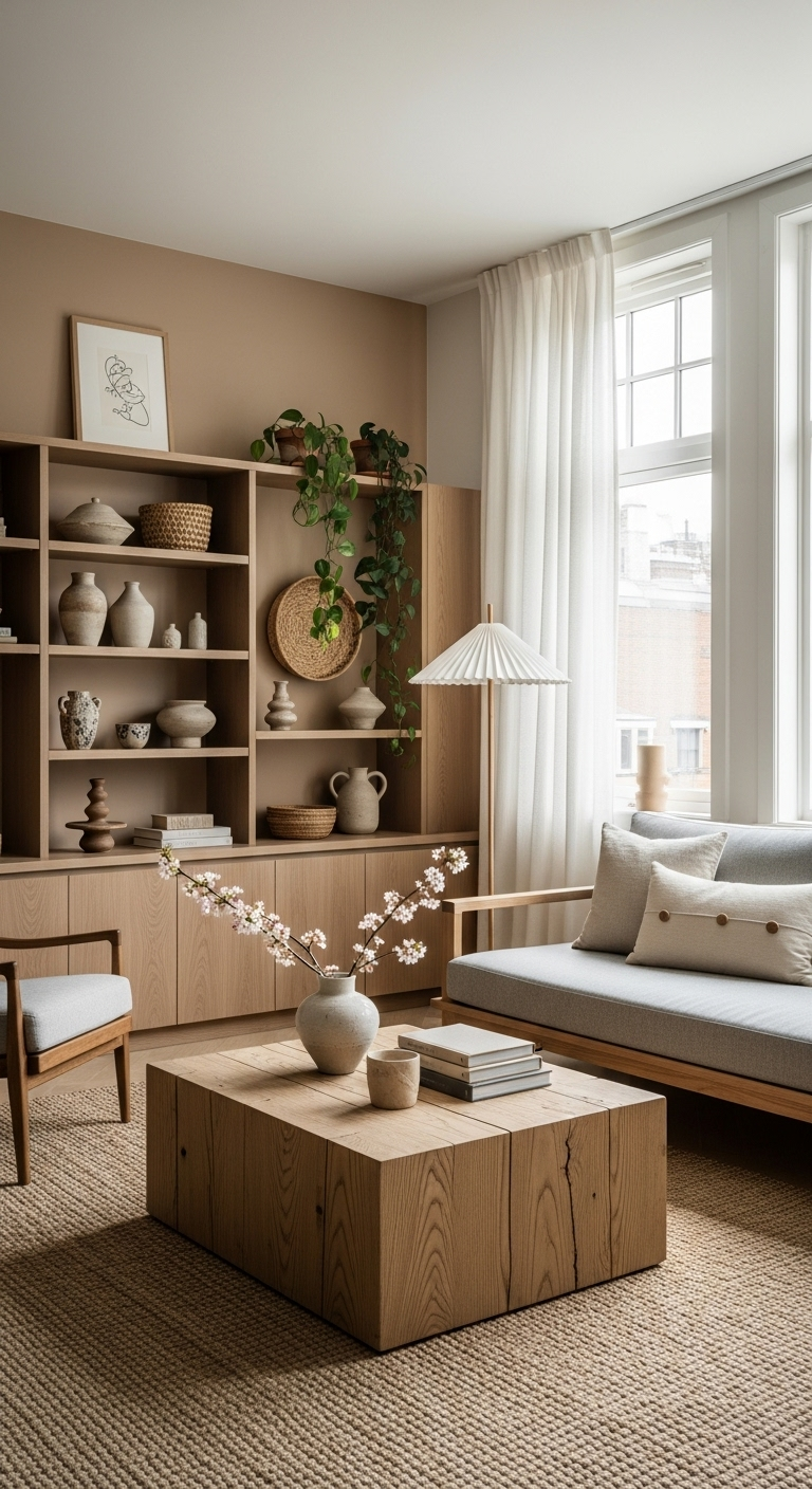
Smoked oak features a distinct greyish-brown tint that immediately brings a sophisticated, contemporary feel to any flooring or furniture. This specific color profile hides everyday wear and tear quite well, making it a practical choice for high-traffic areas.
The finish typically maintains a sleek, matte quality that absorbs light rather than reflecting it across your living space. Because of this muted sheen, the wood provides a calm backdrop that allows other decor elements to take center stage.
Many homeowners prefer this look because it avoids the warm, orange undertones often found in traditional golden oak planks. It serves as a professional foundation for your home, offering a polished aesthetic that feels current and intentionally styled.
You will find that this material works exceptionally well in open-concept floor plans where you want visual continuity throughout. The consistent tone creates a seamless flow from one room to the next, enhancing the overall feeling of spaciousness.
20#. Burnished Copper and Bronze
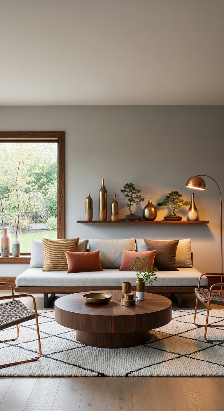
While not a traditional paint color, burnished copper and bronze shades are essential components for your home’s metallic hardware. Use these finishes on kitchen faucets, door handles, or light switch plates to introduce a subtle, warm, and festive shimmer.
These specific metals develop a unique patina over time, which aligns perfectly with the Japanese appreciation for natural aging. This evolution adds character to your living space, ensuring your home feels lived-in rather than like a pristine showroom.
Opting for these warmer metals provides a touch of quiet luxury that feels completely grounded and entirely authentic. They avoid the overly polished, flashy aesthetic of bright chrome, offering a softer alternative that blends into your surroundings.
Choosing these materials allows you to highlight small architectural details without distracting from your larger design furniture pieces. It creates a balanced environment where your hardware acts as a sophisticated accessory rather than a focal point.
21#. Pale Bone for Minimalist Walls
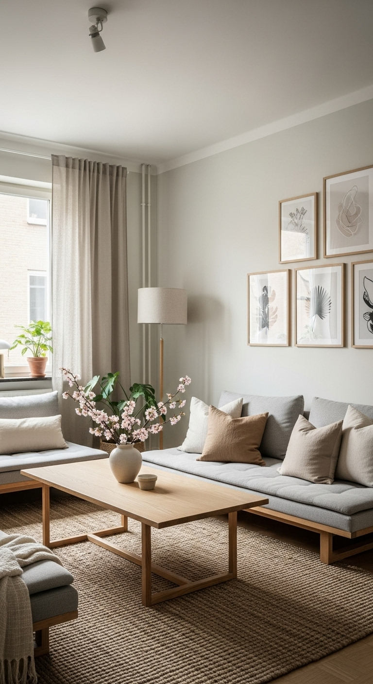
Pale bone acts as a sophisticated, cooler alternative to standard oatmeal, featuring subtle grey-yellow undertones that feel structured. This shade serves as an ideal backdrop for a gallery-style living room where your art should take center stage.
The color provides a sharp, clean environment that highlights the unique shapes and silhouettes of your minimalist furniture. It remains a highly versatile choice for any home, offering a crisp look that feels intentional and expertly curated.
As a non-white hue, it adds a distinct layer of quiet luxury to large, open-concept spaces across your floor plan. The undertones are soft enough to remain neutral, yet they offer more visual interest than a basic flat white.
You will notice that this shade shifts gracefully with the natural light, making your living area feel bright and airy. It is an excellent foundation if you want to emphasize architectural features like high ceilings or large, expansive windows.
22#. Slate Blue for Grounding
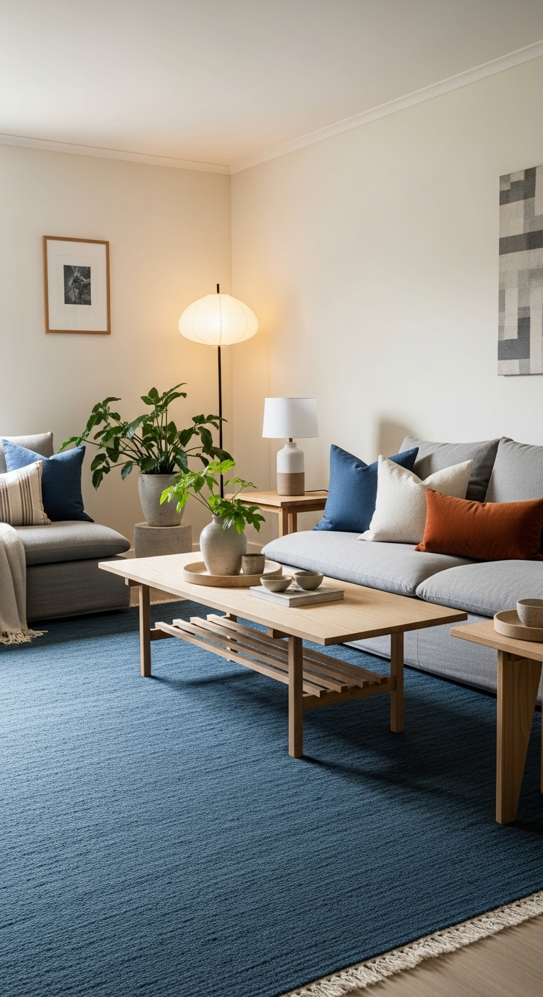
Dark slate blue serves as a grounded, calming alternative to traditional charcoal when applied to lower kitchen cabinets. This deep color feels deeply connected to nature, mimicking the rich tones of evening shadows or quiet water.
Incorporating this shade into your kitchen or vanity area adds a distinct sense of stability to the room. It transforms a busy workspace into a serene environment, helping to minimize visual clutter during your daily tasks.
The hue is surprisingly timeless, providing a sophisticated depth that remains relevant regardless of changing interior design trends. It acts as a strong foundation, allowing your chosen hardware and countertops to shine without losing its own impact.
You will find that this blue tone creates a welcoming atmosphere that feels both professional and incredibly personal. It is an excellent choice for anyone looking to move away from stark black while maintaining a bold, moody.
23#. Warm Honey for Lighting
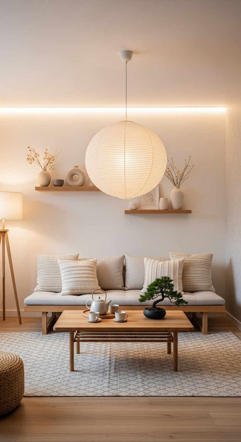
The target for your home lighting should always be a warm, honey-like temperature to create a truly inviting sanctuary. This soft golden radiance generates an instant sense of comfort, making your living space feel cozy once evening arrives.
Focusing on these warmer tones helps you achieve a relaxing atmosphere that is essential for unwinding after long days. You will notice that the golden hue transforms every room into a retreat that feels both intentional and personal.
Steer clear of cool, blue-toned light bulbs at all costs, as they can quickly make your carefully styled home feel clinical. The wrong light temperature will clash with your natural wood finishes, flattening the depth you have worked to build.
Consistent, warm lighting ensures that your chosen interior design elements feel cohesive regardless of the hour or season. Investing in the right bulbs is a simple step that significantly impacts the overall success of your design aesthetic.
24#. Soft Taupe for Textured Walls
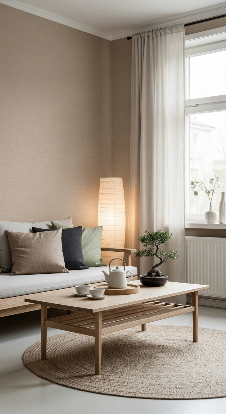
Using a soft taupe lime-wash or plaster finish on your walls introduces a beautiful, stony texture that feels perfectly Wabi-Sabi. The subtle color variation found within the plaster creates a unique sense of depth and history on your walls.
This tactile approach to wall treatments has become a major design trend in 2026 for those valuing natural aesthetics. It provides a way to elevate your space, making your home feel much more handcrafted and undeniably one-of-a-kind.
The finish works exceptionally well in living areas where you want to move beyond the flat look of paint. It brings an architectural quality to the room, catching the light in ways that highlight the natural, organic movement.
Choosing this direction ensures your home feels grounded and authentic, moving away from mass-produced styles found in generic spaces. It is a sophisticated method for introducing neutral tones while still making a major, intentional statement in your design.
25#. Matcha Green for a Pop of Life
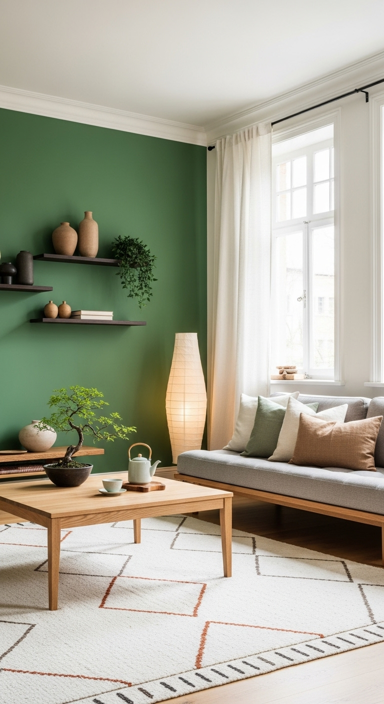
Inspired by the traditional Japanese tea ritual, a lively matcha green serves as the perfect small accent for your decor. You can easily incorporate this shade through a set of ceramic mugs, a small desktop planter, or decorative books.
This specific green feels incredibly fresh and modern, providing a bright, sharp contrast to more muted forest tones. It introduces a sense of natural energy into your space without overwhelming the calm, neutral palette of your home.
Using such a bold color in small doses keeps your design feeling intentional rather than cluttered or overly busy. It is a playful, sophisticated way to bring a touch of Japanese culture into your current interior color scheme.
You will find that this hue works exceptionally well when placed against natural wood or crisp, white surfaces today. It draws the eye naturally, acting as a small spark of personality in a room defined by minimalist principles.
26#. Mushroom and Peat
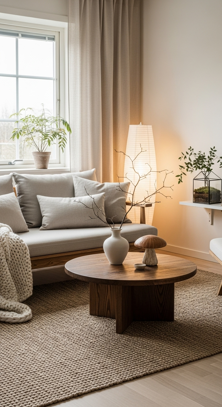
Mushroom tones offer a deep, earthy neutral that provides a sophisticated warmth without veering into the reddish hues of terracotta. This color serves as a perfect bridge between stone-inspired grey palettes and the natural, organic browns found in nature.
You can use this shade for your area rugs or heavy floor cushions to establish a grounded, cozy seating area. It creates an immediate sense of comfort that encourages guests to settle in and enjoy your home’s relaxed atmosphere.
These peat-inspired colors feel deeply connected to the forest floor, which reinforces the organic roots of your design style. By bringing these grounding elements into your main living area, you bridge the gap between interior and exterior spaces.
The depth of this neutral makes it a versatile choice for anyone wanting to add warmth to a minimalist home. It is an ideal solution when you need to introduce weight and comfort without relying on overly bright colors.
27#. Pale Lemon for a Bright Spark
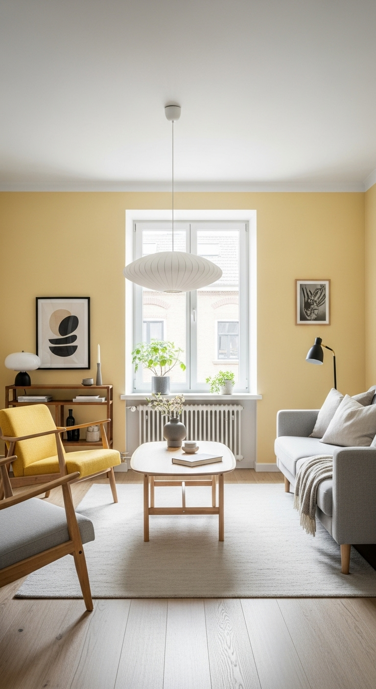
A very pale, citrusy lemon shade is an excellent choice for adding a sun-drenched quality to dark hallways or corners. This color should be utilized quite sparingly, perhaps through a single piece of glass art or a textured pillow.
The hue acts like a subtle burst of sunshine, making your space feel more energetic without appearing visually loud. It provides a necessary lift to areas that might otherwise feel neglected or heavy during the late afternoon hours.
Designers often reach for this shade when they need to introduce a lighthearted element to a sophisticated home. It maintains your overall minimalist integrity while offering a surprising, refreshing change of pace for your interior design style.
You will find that this bright spark effectively balances out heavier charcoal furniture or rich, dark walnut wood flooring. It creates a sense of equilibrium that keeps your home feeling airy, cheerful, and remarkably well-lit throughout the day.
28#. Weathered Wood Grey
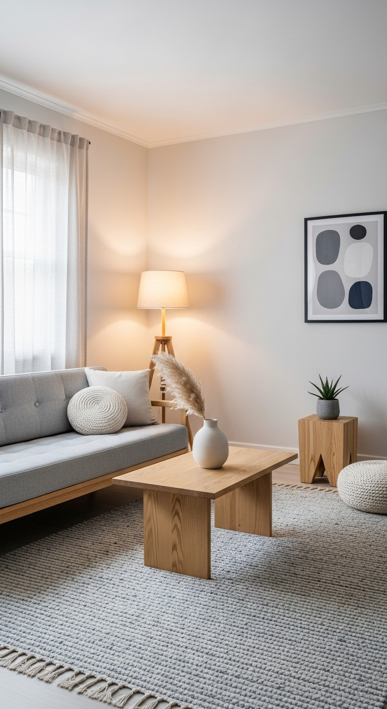
The appearance of sun-bleached, weathered wood offers a beautiful, relaxed addition to your modern Japandi color palette ideas. This distinct silvery-brown tone feels remarkably natural, making it an excellent choice for outdoor furniture or feature walls.
Incorporating this look provides a sense of connection to the outdoors and highlights the natural passage of time. This appreciation for organic aging is a core element of the Japanese aesthetic, adding character to your home.
You will find that this muted shade acts as a versatile neutral that blends easily into your current setup. It brings an immediate sense of ease to any room, helping you create an environment that feels lived-in.
The texture of the wood itself adds visual interest, ensuring your space remains engaging without needing bold paint. It serves as a professional foundation for your design, offering a timeless quality that feels both rustic and modern.
29#. Dusty Lavender for Serenity
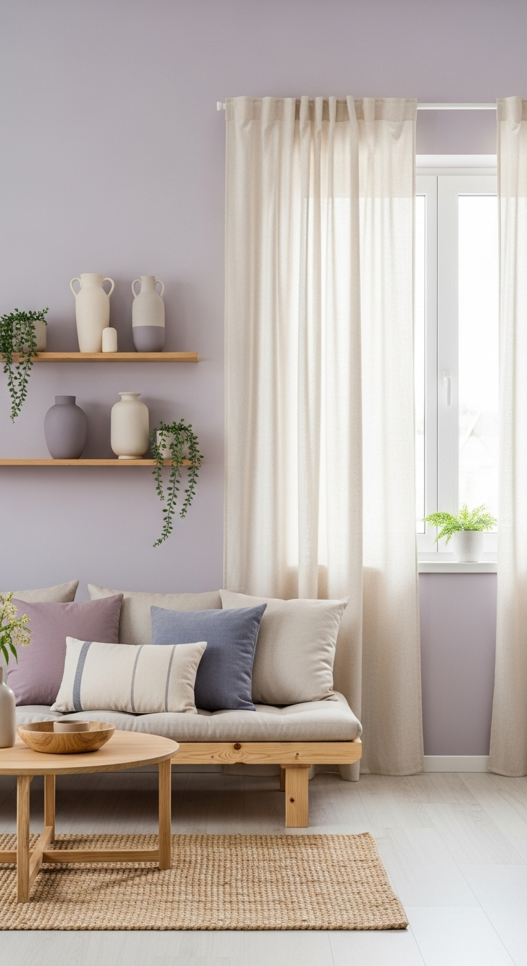
A muted, greyish lavender serves as an unexpected yet highly effective color choice for a dedicated home spa area. This specific hue is widely recognized for its calming properties, which help to reduce stress and promote inner peace.
You can easily transform a quiet corner of your home into a restorative retreat by applying this soft tone. It provides a gentle shift from your primary living spaces, creating a clear psychological boundary for your daily relaxation.
To ensure the space remains sophisticated, keep the lavender shade extremely “dusty” to avoid any association with traditional pastels. This depth prevents the room from feeling like a nursery, instead offering a mature and grounding atmosphere for meditation.
You will find that this color encourages a slower pace, making it perfect for your morning routine or evening. It adds just enough personality to the room while remaining subtle enough to support your focus and quiet reflection.
30#. Polished Concrete Grey
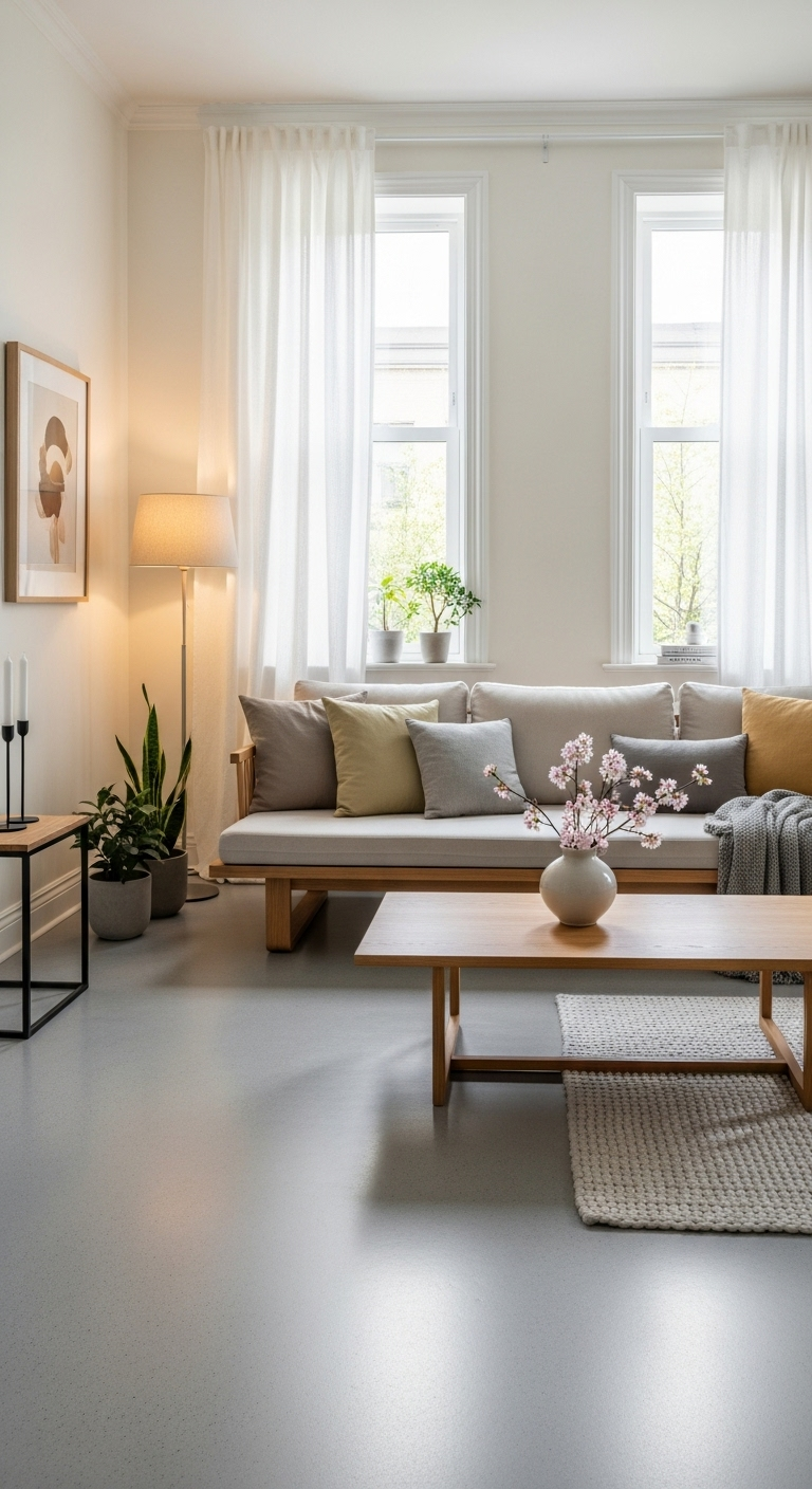
The cool, industrial grey of polished concrete has become a staple for modern Japandi-inspired kitchens and high-end bathrooms. This finish provides a sleek, seamless appearance that is incredibly durable and easy to maintain for a busy household.
Incorporating this material into your design offers a clean, architectural quality that defines a contemporary living space today. It brings an undeniable sense of stability, serving as a solid foundation that stands up well to daily use.
You will find that this grey shade acts as a perfect neutral bridge between warm woods and metal. It creates the right balance for your home, ensuring the various materials complement each other without clashing in tone.
Using concrete adds a touch of urban loft style to your minimalist design, making the interior feel current. It is a sophisticated choice for anyone wanting to maintain a clean aesthetic while adding a bit of edge.
31#. Warm Clove and Nutmeg
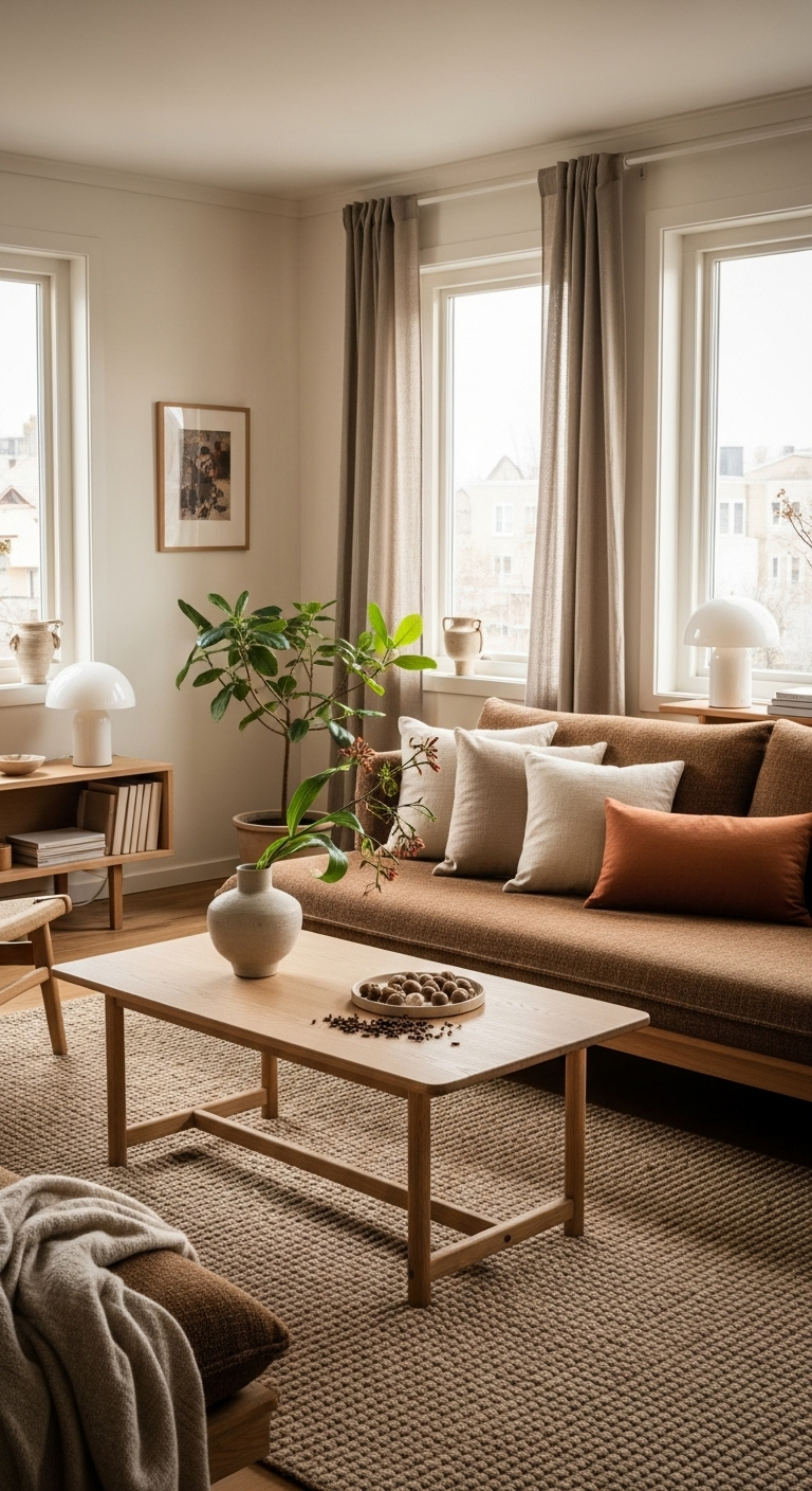
Incorporate the rich colors of warm spices like clove and nutmeg through your choice of wood stains and leather. These deep, reddish-brown tones add a sense of luxury and comfort that works perfectly for a home office.
The warmth inherent in these shades creates an inviting atmosphere that makes long work hours feel much more manageable. You will find that they provide a beautiful contrast against pale walls, making your furniture stand out effectively.
This approach transforms standard office equipment into a collection of valuable, curated pieces that anchor the entire room. The deep pigments pull the eye toward your primary furniture, creating a focal point that feels professional and intentional.
These spiced tones bring a sense of history and significant depth to the modern, minimalist Japandi-inspired home today. They prevent the space from feeling too stark by introducing a layer of classic, timeless appeal to your workspace.
32#. Soft Primrose for a Gentle Glow
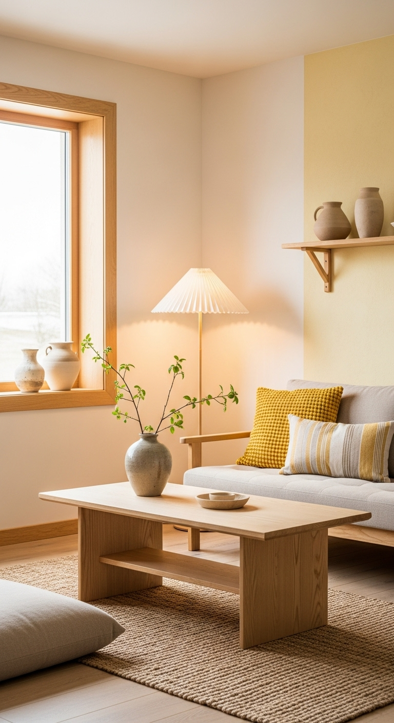
A very soft, creamy primrose yellow serves as an excellent tool for adding a gentle glow to windowless rooms. This specific shade mimics the feel of early morning light, making any basement or interior space feel inviting.
The color works to lift the atmosphere, ensuring that enclosed areas do not feel dark, cramped, or overly heavy. You will find that this hue provides a subtle luminosity that makes your home feel more welcoming throughout today.
Designers often choose this soft yellow when they need to influence the mood of a room lacking sunshine. It acts as a smart, functional fix that turns an overlooked space into a bright and comfortable living area.
The creaminess of the tone prevents it from feeling too vibrant or energetic for a room intended for rest. It remains a sophisticated choice that maintains the minimalist integrity of your home while offering a needed warmth.
33#. Charcoal Silk for Luxury
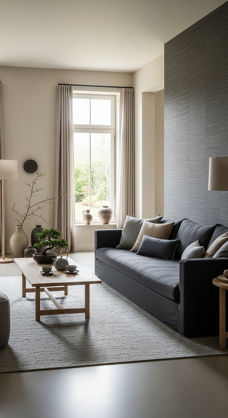
Use charcoal fabrics with a silk or satin finish for your cushions and curtains to introduce high-end Japanese luxury. The way natural light interacts with this darker material creates a subtle, refined shimmer that feels incredibly sophisticated today.
This choice allows you to introduce a touch of elegance that remains entirely consistent with your minimalist design goals. You will find that the fabric adds a distinct depth to your living space, making the room feel intentional.
The charcoal silk look provides a beautiful, polished contrast against the raw, matte textures of your wood furniture. It anchors the room visually, providing a strong focal point that balances out your lighter walls and flooring finishes.
Incorporating these materials ensures your home feels expertly curated, moving beyond simple decor into a more professional realm. It is an ideal method for adding a layer of subtle glam that respects the quiet nature of Japandi.
34#. Deep Ochre for Earthy Vitality
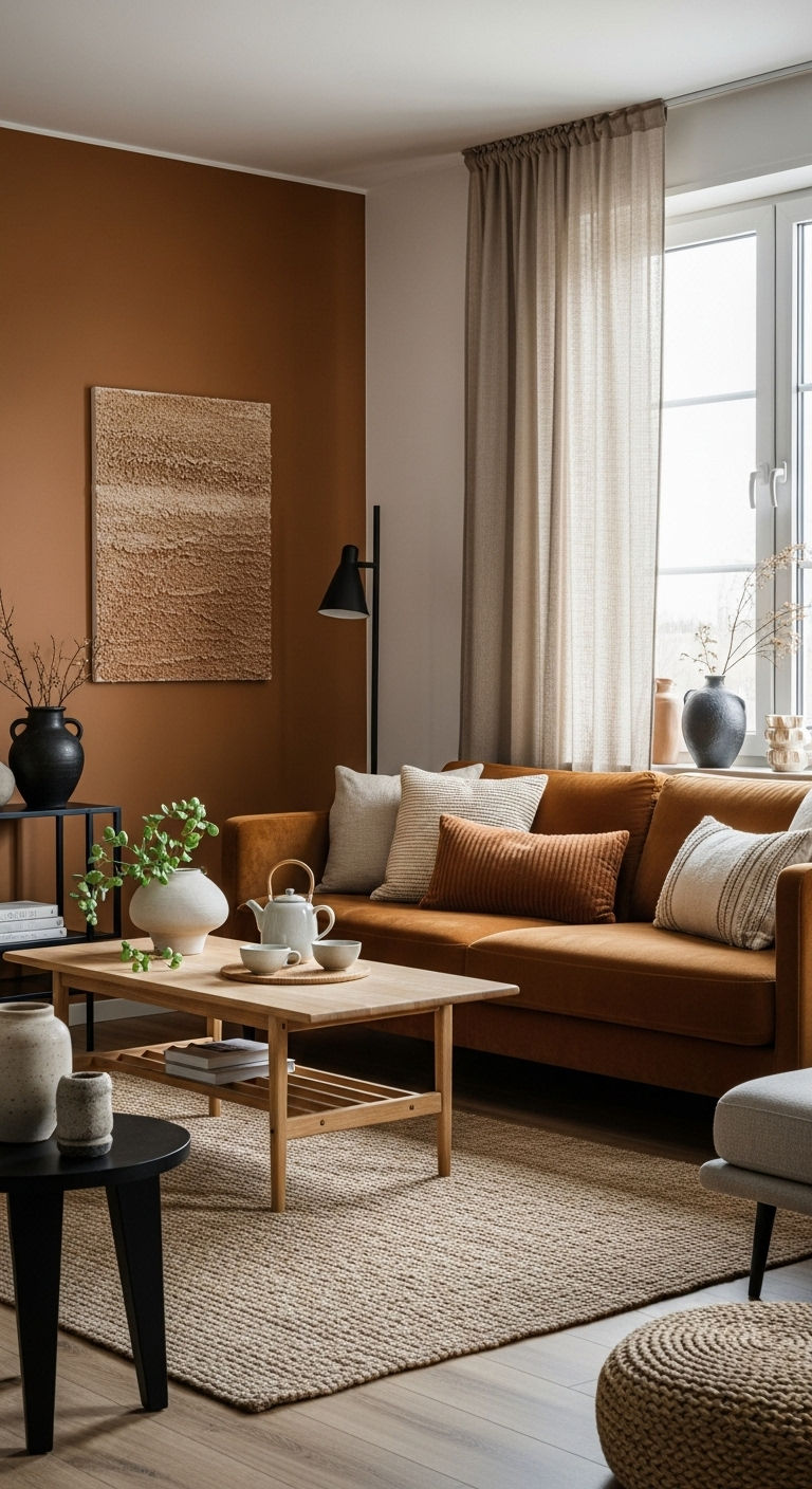
A deep, golden ochre serves as a powerful tool to inject vitality and energy into your dining room or social areas. This color feels both traditional and grounded, drawing direct inspiration from the rich, natural pigments of the earth and sun.
Integrating ochre into your home creates a warm, inviting center that naturally encourages conversation and gathering. You will find that it stands out as a bold, intentional choice that breathes life into your living layout today.
Despite its intensity, this shade remains remarkably harmonious when paired with your existing Japandi-inspired color palettes. It complements the soft neutrals and natural materials that define your home, adding a vibrant focal point without disruption.
Using this color ensures your social spaces feel dynamic and welcoming, moving away from overly sterile or flat designs. It is a sophisticated way to balance energy and peace, reflecting a well-rounded approach to modern interior styling.
35#. Frosted Glass White
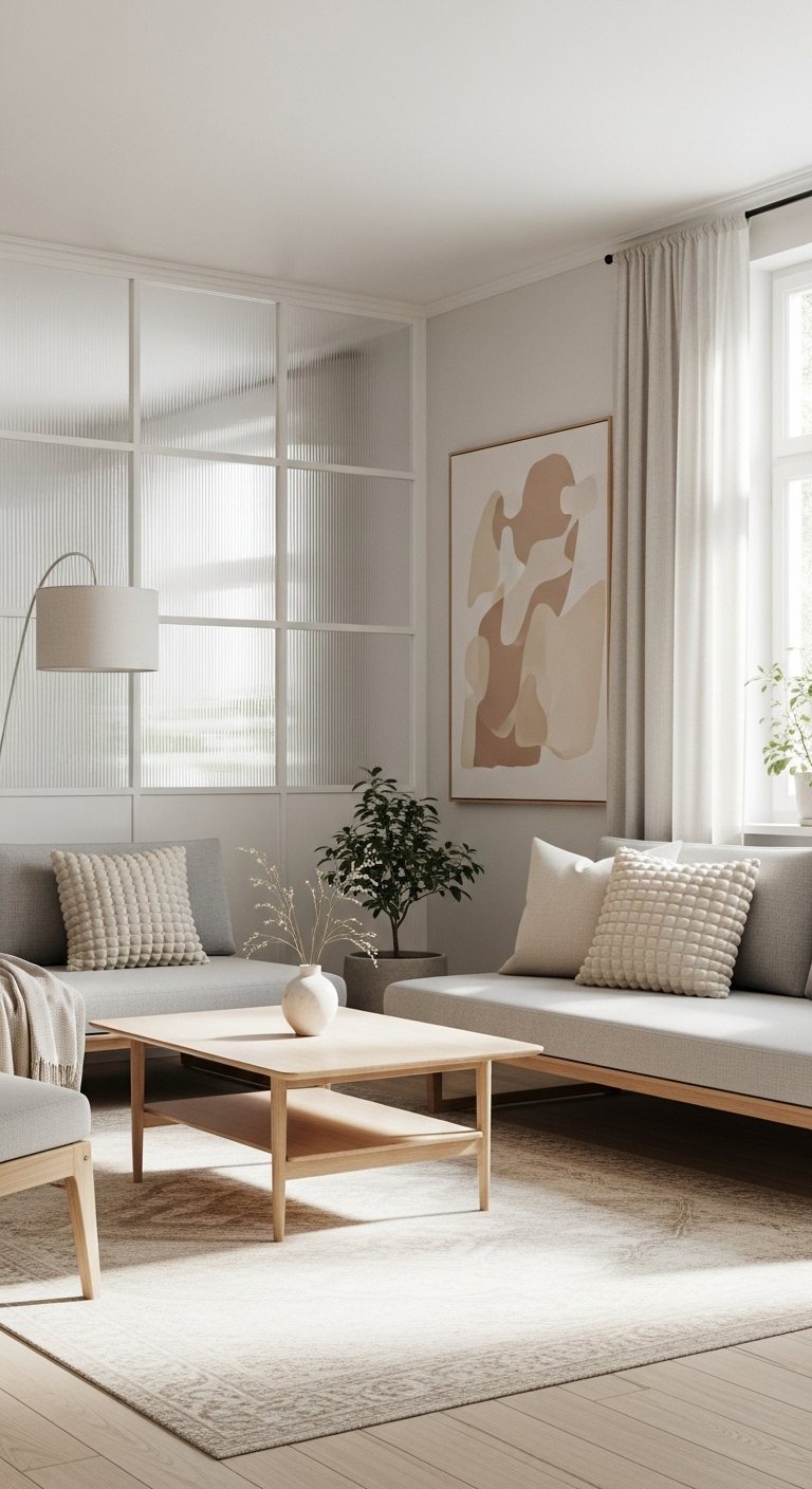
Incorporate the semi-opaque quality of frosted glass through your light fixtures and cabinet inserts to achieve a soft, intentional look. This material diffuses light beautifully, creating a gentle glow that effectively eliminates harsh shadows throughout your workspace.
By softening the illumination, you ensure that your home environment remains serene, functional, and visually balanced at all times. You will find that frosted glass adds a layer of necessary lightness, helping bulky furniture feel significantly less imposing.
This technique is particularly useful in smaller rooms where maintaining a sense of openness is a design priority. It is a classic element of Japanese design that integrates seamlessly into your modern, airy Scandinavian-inspired living spaces today.
Using this material allows you to hide the contents of your cabinets while still introducing a sense of movement. It maintains your minimalist clean lines while providing a layer of practical, sophisticated depth to your daily organization.
36#. Muted Apricot for a Warm Pop
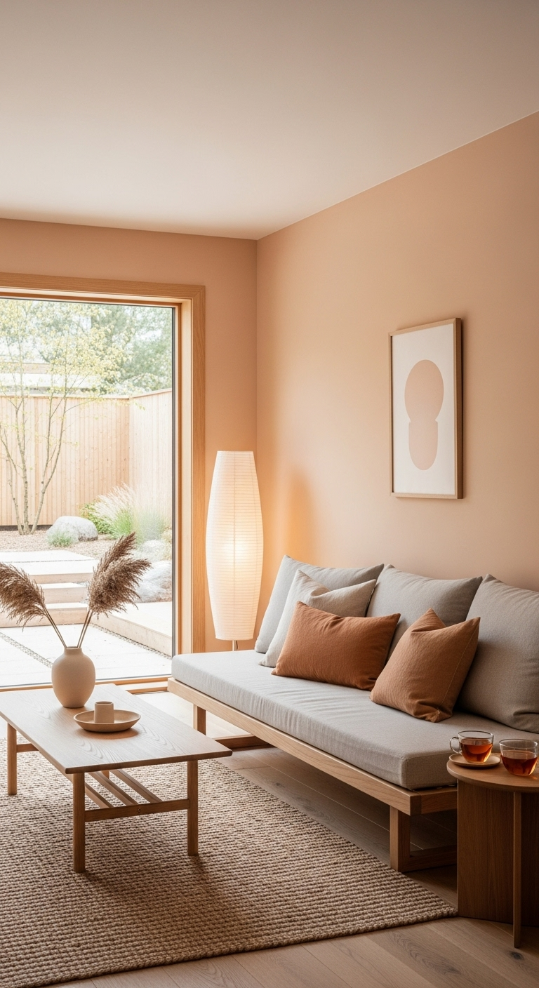
To keep the look balanced and professional, pair your apricot accents with strong charcoal or light grey foundations. These neutral tones act as an anchor, ensuring the apricot stands out as a stylish detail rather than dominating the room.
Focus on layering this color through textiles, such as throw blankets or decorative office accessories, to maintain a subtle impact. This strategy allows you to enjoy the energetic benefits of the color without overwhelming the quiet atmosphere of your space.
The combination of dusty apricot against a grey backdrop creates a modern, high-end feel that is perfectly suited for 2026. It is an ideal solution for those who want to experiment with brighter tones while staying within a cohesive, orderly palette.
As you finalize your room design, remember that color restraint is the key to maintaining a professional home environment. This thoughtful approach ensures your creative sanctuary remains both vibrant and deeply calming for your daily work.
37#. Natural Hemp and Jute Tones
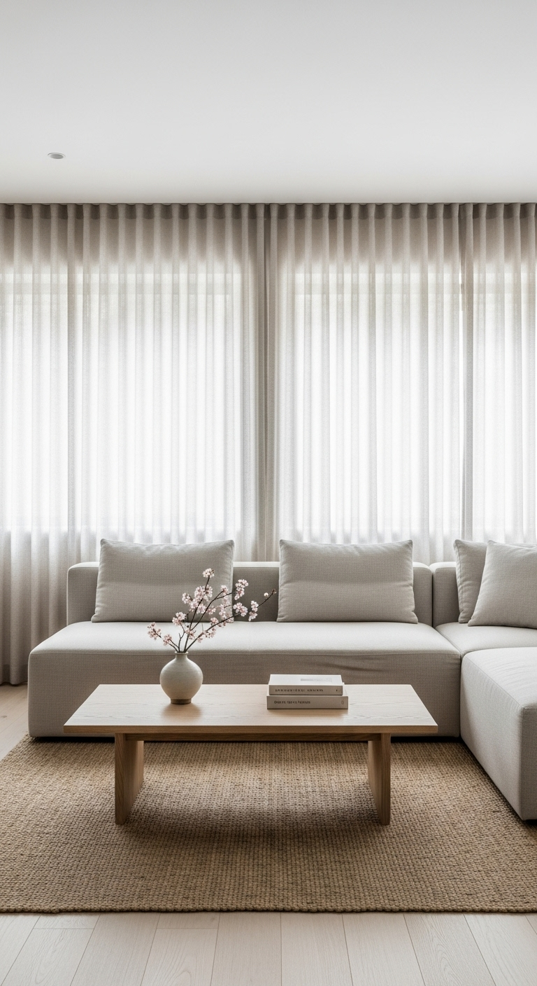
The raw, brownish-tan tones of hemp and jute are essential foundations for your flooring and organizational storage solutions. These shades provide a rugged, durable texture that feels entirely honest and deeply connected to your home’s natural environment.
Using these organic fiber colors helps to ground the more delicate silks, linens, and light wood elements in your design. They serve as the reliable “workhorse” colors of the Japandi palette, providing a base that is as beautiful as it is practical.
You will find that these earthy tones introduce a necessary warmth, preventing your minimalist space from feeling too sterile. They offer a tactile quality that invites interaction, making your home feel lived-in, approachable, and professionally curated today.
Incorporating these materials ensures your organizational systems remain both aesthetically pleasing and structurally sound for long-term use.
38#. Soft Lilac-Grey
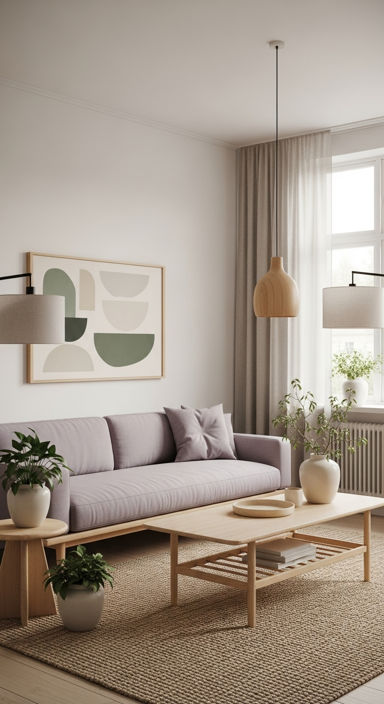
To achieve the best results, pair your lilac-grey walls with crisp silver or polished chrome hardware throughout the room. This combination creates a look that feels both cool and incredibly serene, reinforcing the spa-like quality of the space.
The metallic finishes reflect light, which enhances the softness of the lilac undertones and adds a sense of brightness. Focus on selecting fixtures with clean, linear forms to match the modern, professional tone of your Japandi-inspired home.
Consider adding simple, high-quality white towels or stone accessories to keep the room feeling airy, organized, and clean. These elements support the quiet sophistication of the lilac-grey, ensuring the bathroom remains a beautiful destination within your house.
As you plan your next interior update, remember that even the smallest rooms benefit from a cohesive, professional color narrative. This approach ensures your home remains functional, luxurious, and perfectly aligned with your preference for modern, peaceful living.
39#. Deep Ebony for Structural Detail
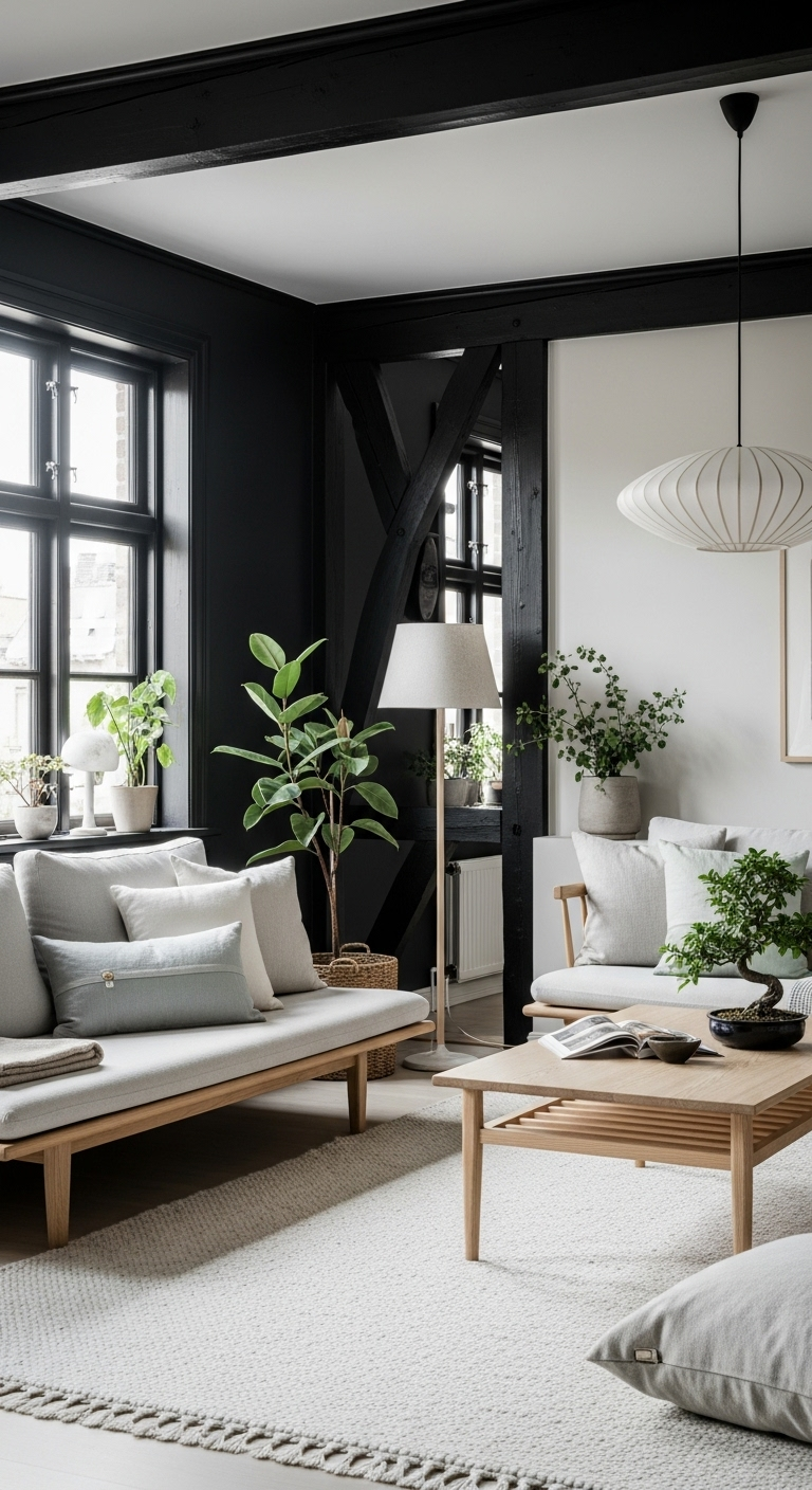
To maintain the serenity of your Japandi aesthetic, pair these deep ebony elements with plenty of soft, neutral surfaces. The goal is to let the dark wood dominate the form while allowing the lighter colors to define the atmosphere.
Focus on creating balance by placing lighter, textured items—such as cream linen cushions or light ash furniture—near the ebony features. This juxtaposition ensures that the space remains inviting and bright, preventing the dark tones from feeling too heavy or overwhelming.
Consider the role of natural lighting when installing these features to ensure the grain and richness of the wood are visible. The interplay between light and shadow on the dark surfaces adds an organic, tactile depth that feels both modern and timeless.
As you plan your next major design element, remember that ebony acts as the perfect anchor for an open-plan layout. This deliberate design choice ensures your residence feels like a professional, peaceful sanctuary that is built with longevity in mind.
40#. Soft Rosewood Accents
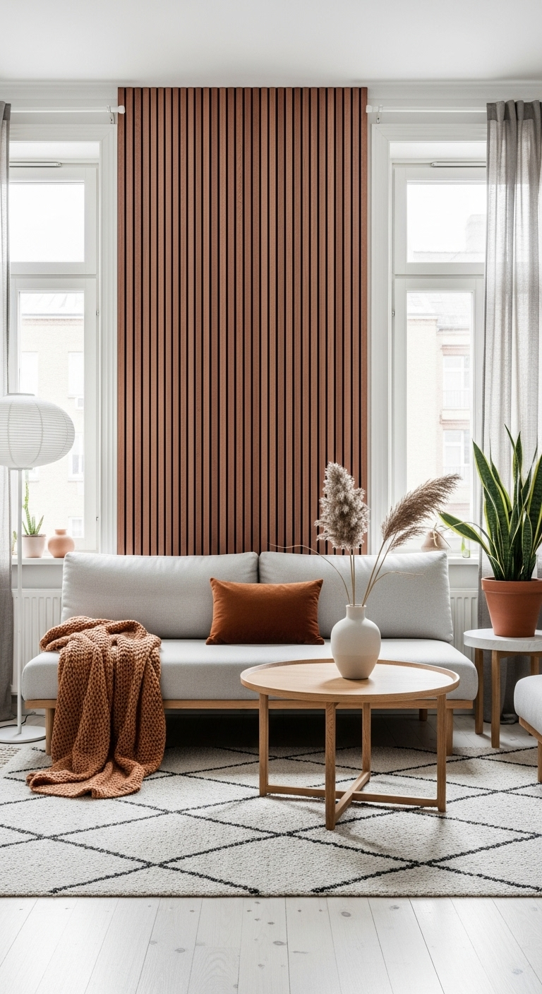
To master this look, pair your rosewood details with your primary, lighter wood foundations to create a balanced, layered environment. The contrast between the deep, red-toned rosewood and a lighter ash or oak base adds significant depth and character to your desk layout.
Focus on keeping the shapes of these accessories simple and clean to respect the minimalist principles of your overall design. When the materials are curated in this manner, the room feels like a professionally styled retreat rather than a standard office setup.
Consider how these warm tones interact with natural light, as they will highlight the richness of the grain throughout the day. This strategy ensures that your workspace remains a functional sanctuary that is both inviting and perfectly aligned with your design aesthetic.
As you continue to refine your interior elements, remember that small, high-quality accents are what make a design feel truly complete. This dedication to material harmony ensures your home stays modern, peaceful, and consistently elevated.
41#. Muted Teal for a Darker Green
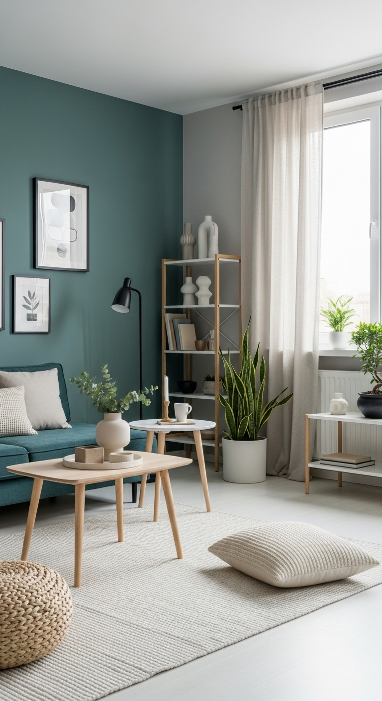
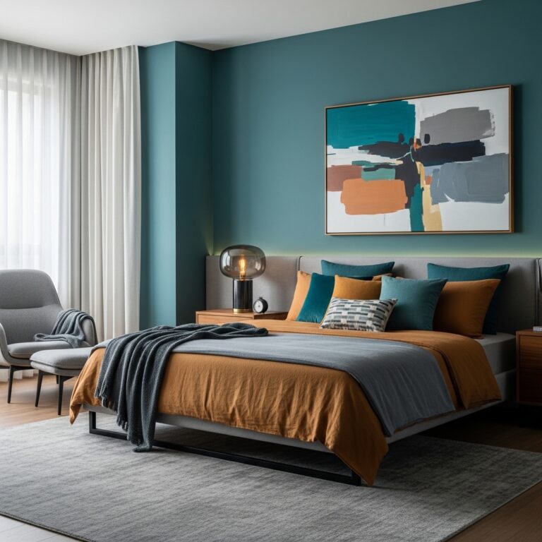
To ensure your lounge remains airy, pair your teal accent wall with light oak furniture and crisp white textiles. These lighter elements prevent the room from feeling too heavy or enclosed during the daytime hours.
Focus on using the light oak to provide a warm, organic contrast to the cool, muted depth of the teal paint. The combination creates a harmonious environment where modern minimalism meets the soothing, natural qualities of the Japandi aesthetic.
Consider incorporating sheer white curtains to soften the light entering the room, which enhances the serene mood of the space. When these textures are layered against your teal wall, the effect is professionally polished and exceptionally comfortable for your daily living.
As you finalize your design updates, remember that muted teal is a powerful tool for adding personality without sacrificing peace. This investment ensures your home feels like a curated, high-end residence that is both functional and beautifully styled for 2026.
42#. Chalky White for a Clean Finish
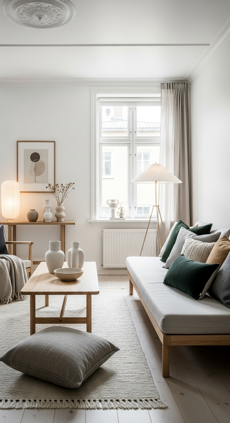
To get the most out of this look, apply your chalky white to door frames, baseboards, and window casings consistently throughout the room. The lack of sheen creates a consistent visual rhythm, which is a hallmark of expertly designed, minimalist interiors.
Focus on maintaining this matte finish to highlight the structural details of your home without adding unnecessary gloss or glare. The resulting softness complements the raw textures of your wood and textiles, making the entire room feel unified and thoughtfully considered.
When your trim and walls interact with natural daylight, the matte white will hold its own against shadows and highlights alike. This adds a layer of depth that is difficult to achieve with traditional, reflective paints, reinforcing the quality of your design.
As you conclude your latest project, remember that the smallest details often yield the most professional and lasting results. This investment in a high-quality matte finish ensures your home remains a serene, functional sanctuary that perfectly embodies the timeless appeal of Japandi style.
Conclusion: Bringing Your Palette to Life
Mastering the art of Japandi design is about more than just picking a color; it’s about creating a harmonious environment where you can truly relax.
By blending these earthy, neutral, and organic tones, you’ve built a home that feels like a sanctuary from the busy world outside. Every hue in your palette works together to foster a sense of peace, order, and timeless beauty.